Your website can be loved by everyone and still sell nothing. The difference isn't seen: it's understood.
You open a website.
It's gorgeous.
Huge photos, a poetic line, lots of air.
And you still don't know what they sell.
The beauty went straight to your eyes.
What you came to find out didn't.
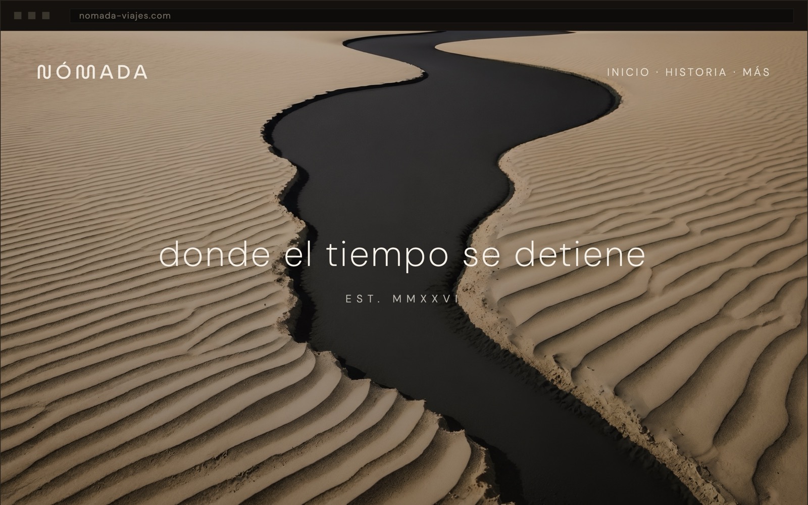
A gorgeous website. The photo draws you in, the type breathes, everything is in its place. And you still don't know what they sell. A hotel? A spa? A watch brand?
is how long the brain takes to judge whether a website is beautiful. That impression is aesthetic, instant, almost animal. But calling, booking or buying demands something else: understanding. And beauty doesn't solve that.
Lindgaard et al. study · cited by Google
A beautiful website earns compliments. A clear website earns customers. They aren't always the same website.
Beauty opens the door. But the one who decides whether to walk in is the visitor — and they only walk in if, at a glance, they understand what's inside, who it's for, and what to do next.
“Where time stands still” is a beautiful line. It's also a line that says nothing.
When the first thing your customer reads is poetry instead of an answer, you've handed them beauty and taken away the exact information they came to find.
It's not about choosing between beautiful and clear. It's about the order. Clear first; then, as beautiful as you like. Clear is what converts. Beautiful is what makes it convert better.
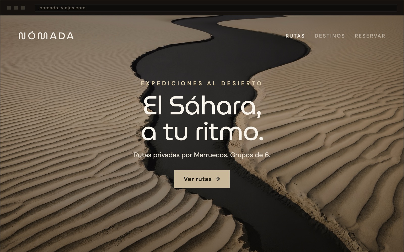
Same brand. Same photo. But now you get it in a second: desert travel, private routes, small groups — and a button telling you what to do. The beautiful didn't change. The clear did.
If your main line could work just as well for a perfume, a hotel or a real-estate agency, it isn't saying what you do. It sounds good, but it's interchangeable — and the interchangeable is neither remembered nor chosen.
If the visitor has to scroll down to understand your business, you've already spent the seconds you had. The answer to “what is this, and is it for me?” belongs at the very top, in plain sight — not hidden three screens down.
Spectacular images and not one clear button. If the website doesn't say what to do next — call, book, request a quote — the visitor does the easiest thing there is: close the tab.
The most honest test needs no tools and no agencies. Just someone who doesn't know your business.
Show your website to an outsider for 3 seconds and close it. Nothing more: three seconds, then gone.
Ask them three things: what you do, who it's for, and what you should do right now on that website.
If they hesitate on any of them, it isn't a design problem. It's a clarity problem. And clarity gets fixed before colour.
At Onaia we design beautiful. But clear first. If your website is liked and still doesn't bring you customers, this is probably why.
Let's talk about your website →No weekly newsletters. No spam. Just an email when we publish something worth reading.