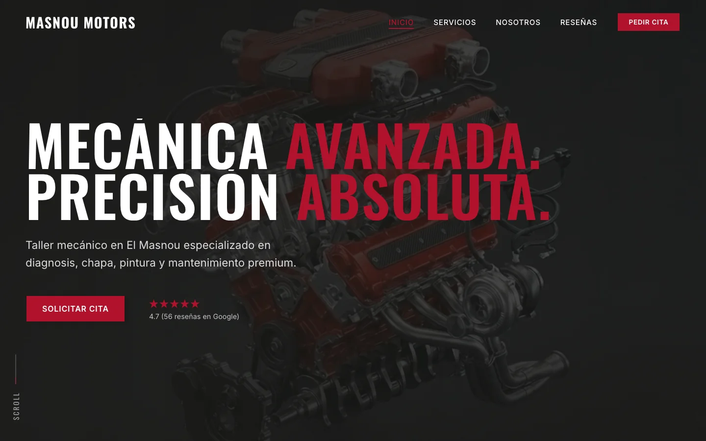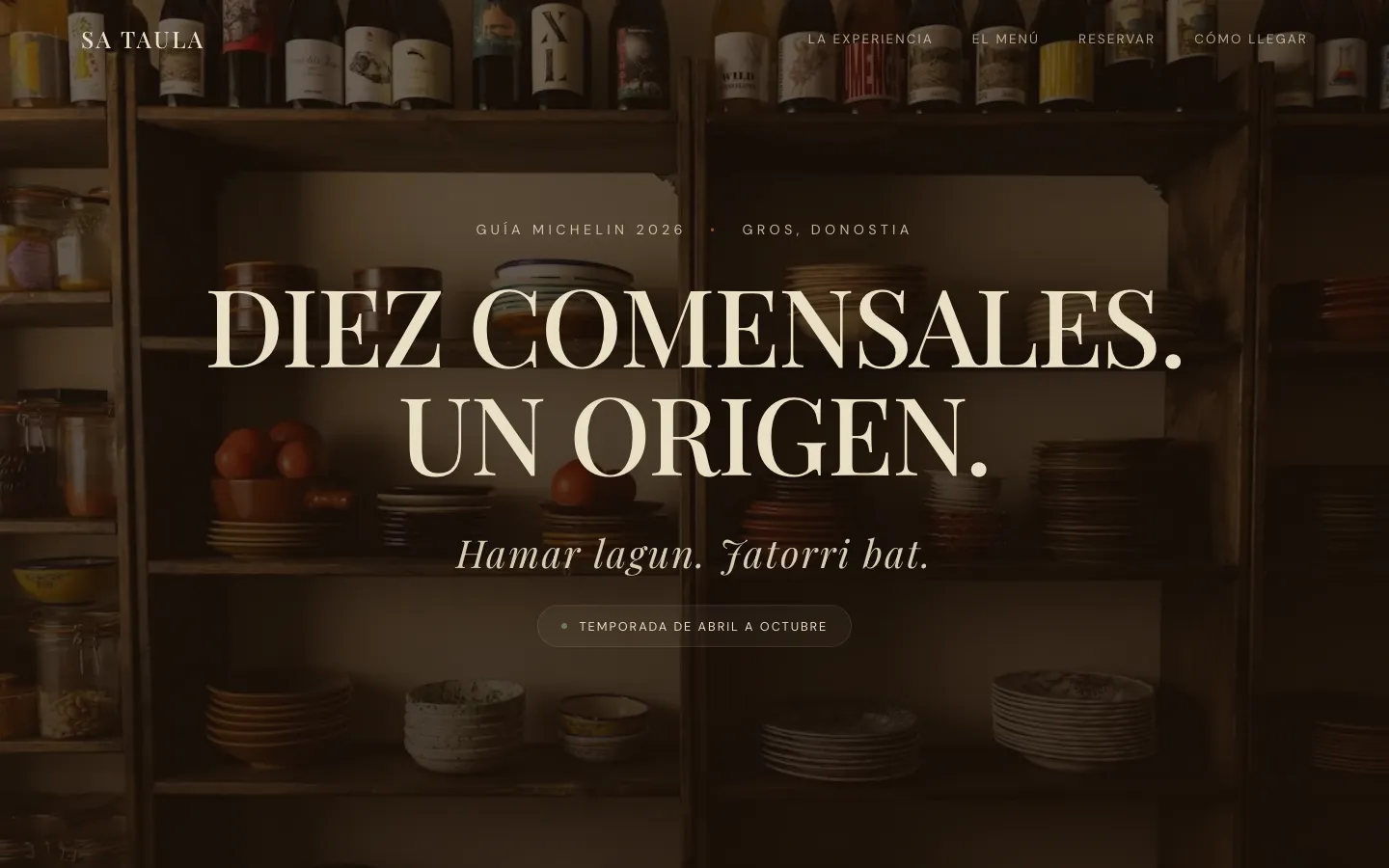
The domain was bought; the website was not built.
A restaurant with a single shared table for ten diners every night, recognised by the press and the guides. Its domain had long sat on a “coming soon” page and the only way to book was a loose widget linked from Instagram.
A place like this isn't explained with a menu and a phone number: the experience has to be told before anyone decides to book.
Three things to stand out.
- 01
Tell the experience, not just the menu
Shared table, single menu, seasonal produce: what makes it different had to be the first thing read.
- 02
Book with clarity
Price, what is included, capacity and season explained before asking for a booking, so whoever arrives already knows what they're coming for.
- 03
A voice of its own
Spanish with touches of Basque —“Hamar lagun. Jatorri bat.”— so it sounds like that place and not like just any restaurant.
Designing a dinner.
- 01
Dark and editorial
Near-black background, classic serif and lots of air: the website reads the way you walk into a dimly lit dining room.
- 02
One decision per screen
One headline, one idea and one action. The single menu is explained in its own block, competing with nothing.
- 03
The facts that matter, together
Price per person, drinks included, maximum diners and season appear on one line, with no small print.
How it looks.
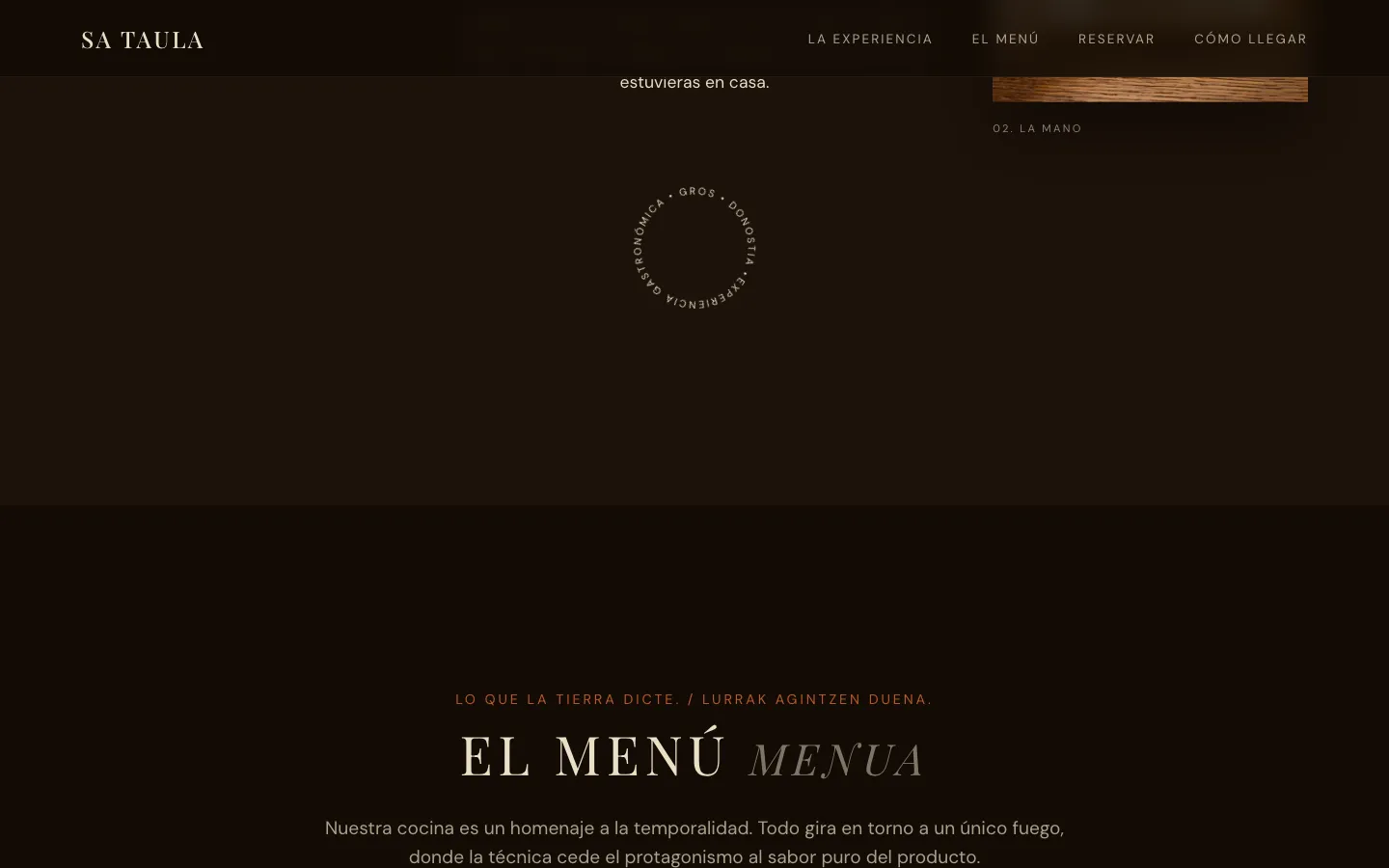
The single menu, told as a story.
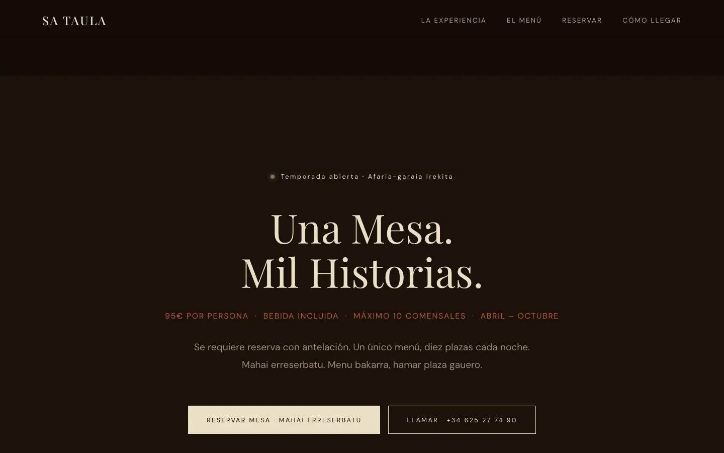
“One table. A thousand stories.” with price, capacity and season.
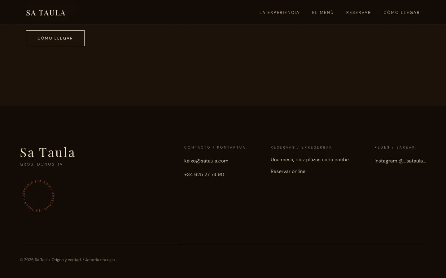
Close: how to get there, contact and bookings.
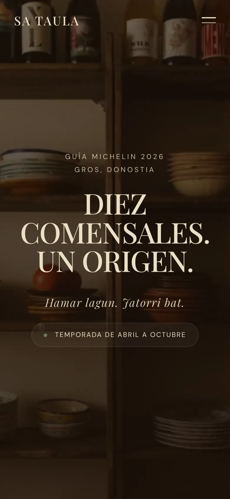
Made on our own initiative.
Nobody asked us for this website: we imagined how this business would look with an online presence worthy of its work. Texts and images come from public information and are a starting point; everything can be changed. The photographs come from their Instagram and would be replaced with their own.
If your business has a good reputation and a website that doesn't show it, that's where we start.