A five-star reputation with a website that didn't match it.
A multi-brand garage in the Eixample with a near-perfect Google rating and reviews that repeat one phrase: personal service.
Its website, built with an old site builder, wasn't up to it: when someone compared it with another garage, the first impression didn't work in its favour.
Three things to stand out.
- 01
Turn the service into the argument
If what clients say is “they explain what they do”, the website had to say the same in its first headline.
- 02
Clear services and price
Diagnostics, general mechanics, oil change, pre-inspection, air conditioning, electrics: ordered the way someone with a stranded car looks for them.
- 03
Booking within reach
A red “Book now” button always visible, which opens WhatsApp instead of a form.
Designing for someone who fears being told a story.
- 01
A headline that promises what people fear not getting
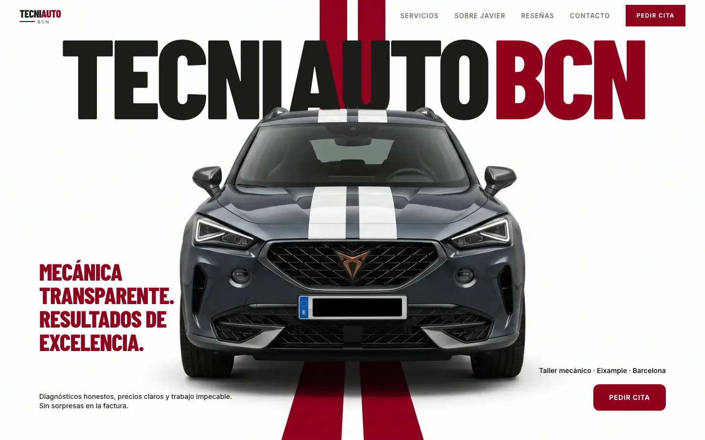
“Transparent mechanics. Excellent results.” and, further down, “The mechanic who tells you the truth”.
- 02
Red and black, condensed type
A restrained racing language: it gives energy and seriousness and lets long texts breathe.
- 03
Reviews on a continuous ribbon
Clients' words cross the screen side to side: social proof that takes no space and is always in view.
How it looks.
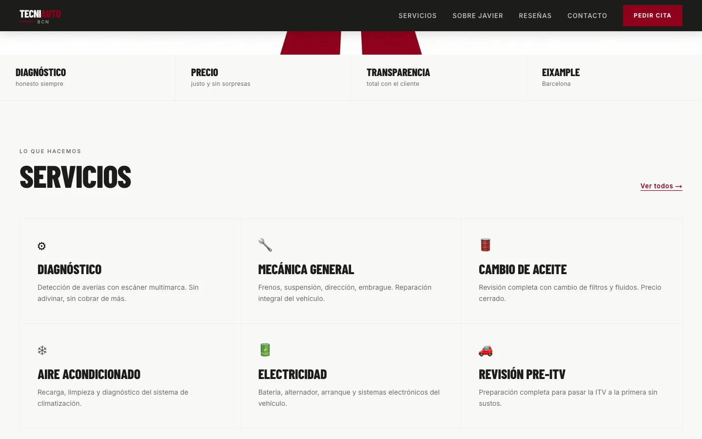
Services: ordered by what the driver needs, not by what the garage does.
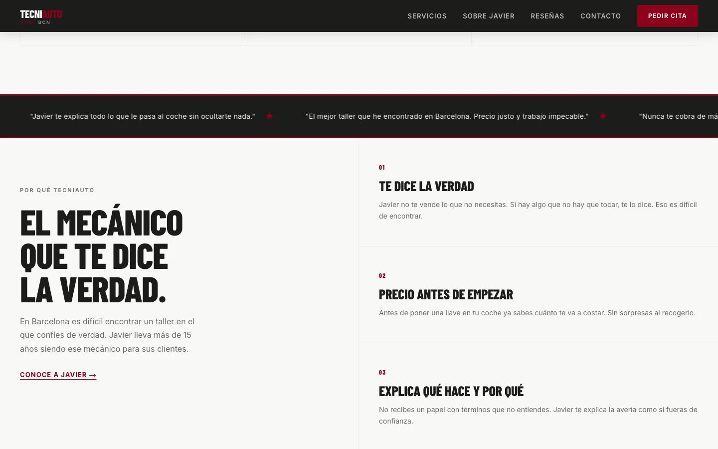
“The mechanic who tells you the truth”: three commitments, one line each.
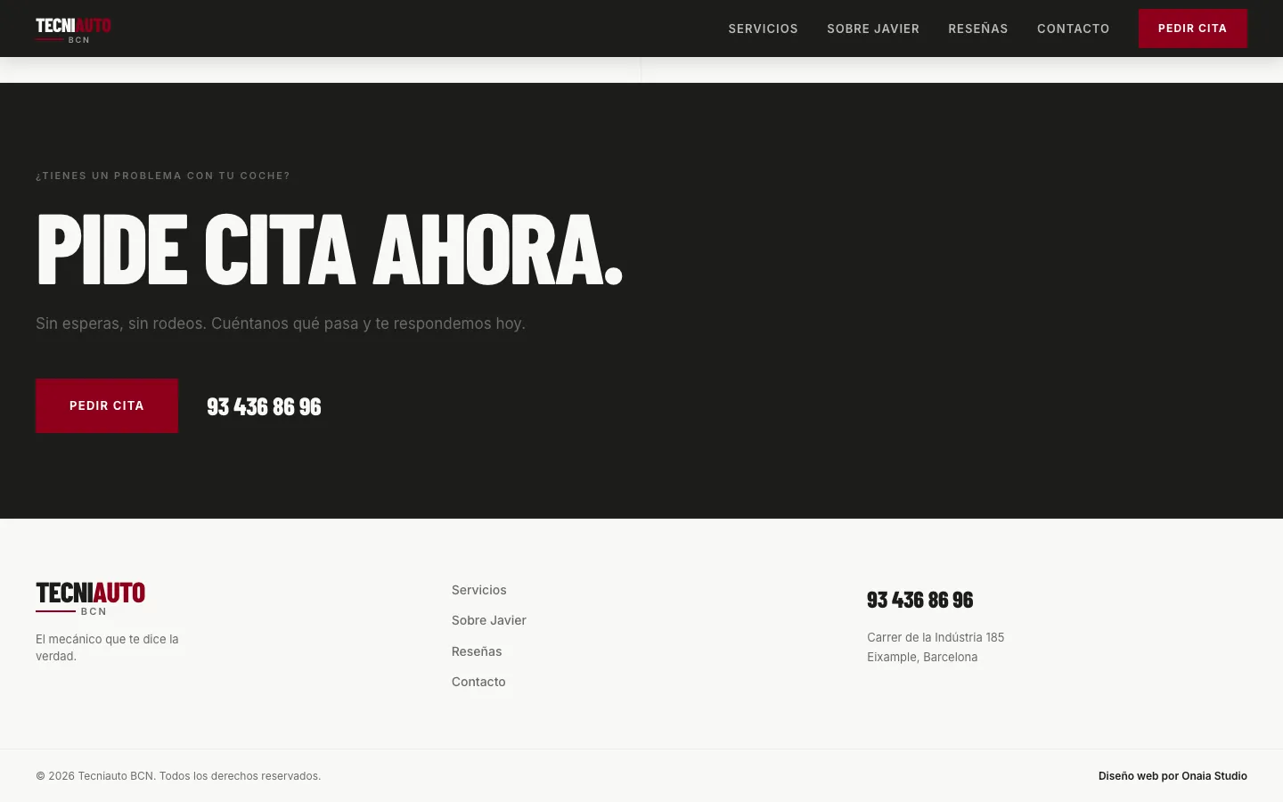
Close: “Book now”, with the phone number beside it.
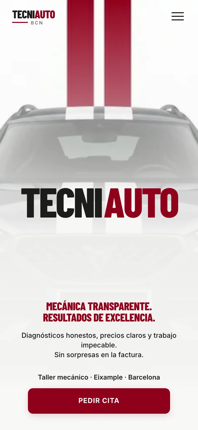
Made on our own initiative.
Nobody asked us for this website: we imagined how this business would look with an online presence worthy of its work. Texts and images come from public information and are a starting point; everything can be changed. Some supporting texts are placeholders still to be replaced with real ones.
If your business has a good reputation and a website that doesn't show it, that's where we start.