We didn't want another postcard-style empowerment website.
FUERZA walks through six decades —from the vote in 1920 to science in 2009 and the present— and anchors each one to a real milestone: a law, a prize, a date. No motivational slogans: if it can't be verified, it doesn't go in.
We wanted a website that reads like a magazine: slowly, page by page, with hierarchy and with silences.
Reading, rhythm and order.
- 01
One decade per screen
Scrolling imitates turning magazine pages: each decade gets its own space, with a large number, a milestone and a photograph.
- 02
A technical system in plain view
A six-column modular grid with fine hairlines always visible, like a magazine layout before printing. The technical adds salt; the editorial leads.
- 03
You always know where you are
A fixed decade indicator in the margin and masthead details —folios, edition, dates— that place the reading, as in a printed publication.
- 04
Alternation
Decades alternate left and right so the eye neither gets used to it nor gets lost.
Warm black and white, not clinical.
- 01
Colour
Bone background, near-black ink and a single sand accent. Photographs in pure black and white. No campaign colours.
- 02
Typography
Large DM Sans Bold headlines, small sober reading text and enormous decade numerals.
- 03
Square corners
No rounding, no shadows: grid, lines and paper.
- 04
Tone
Editorial and restrained: a fact, a date, a person. The closing line —“Strength isn't granted”— is the only sentence with an opinion.
How it looks.
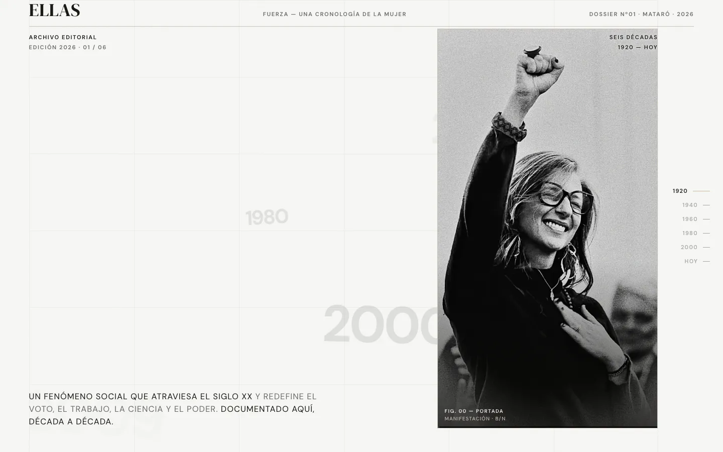
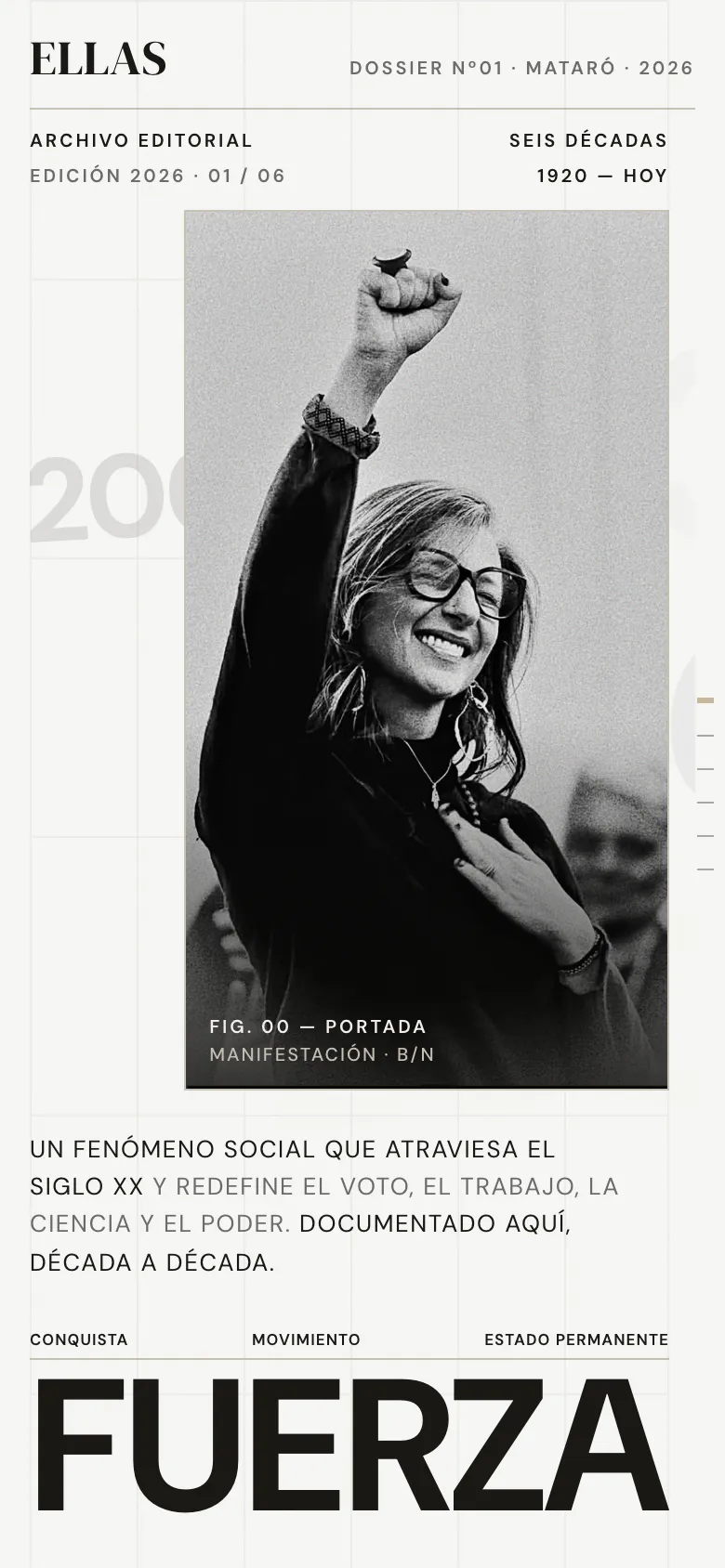
Home: magazine masthead, full-height portrait and the first decade.
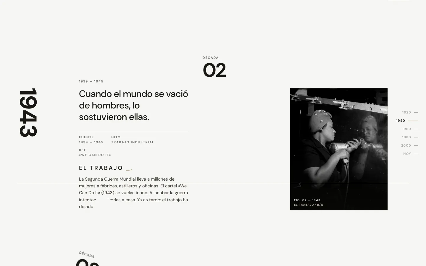
Decade 02 · 1943: work. A huge vertical date, a milestone and its photograph.
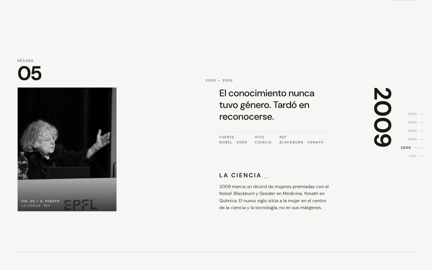
Decade 05 · 2009: science. The alternation flips the side of the composition.
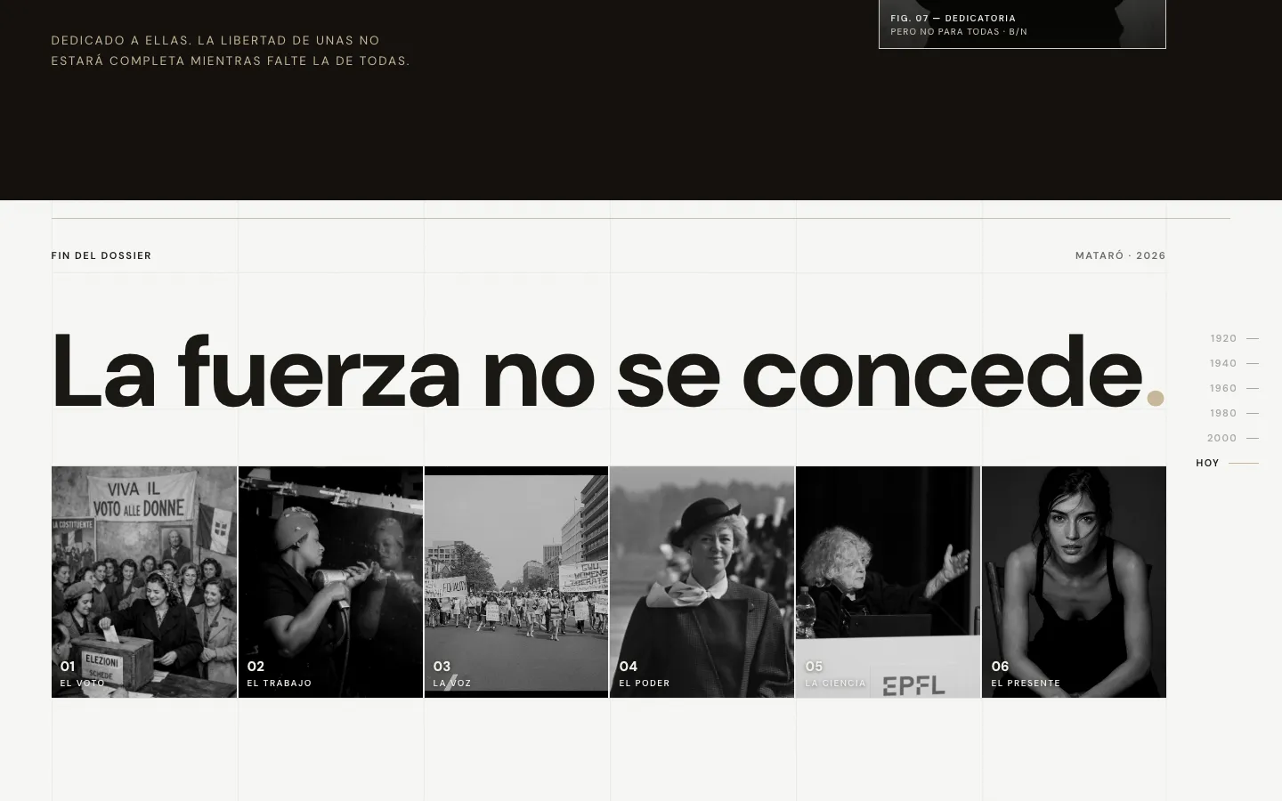
Close: “Strength isn't granted”. The six decades in one strip.
An exercise in judgement.
FUERZA has no client: it is a portfolio piece. We wanted to see what happens when a website gives up the usual tools —carousels, icons, illustrations— and relies only on typography, photography and rhythm.
It is the same discipline we apply to a local-business website, on a different subject: deciding what is read first, what is seen and what is left out.