A 2023 website that didn't speak for the company it is today.
Grafic a la Carta designs and makes menus for the hospitality trade in its own workshop in Mataró. When we arrived, its website was a 2023 template that reflected neither the quality of the work nor the image the workshop already showed on Instagram.
Before proposing anything we ran a full audit: we read the site the way Google would, and the way a restaurant looking for someone to make its menu would. This is what we found.
Six problems, and every one of them cost clients.
- 01
Google didn't know the site was theirs
The identity data search engines read was still the template's, with a name and an owner that weren't the workshop's.
- 02
The footer belonged to another company
It read “Copyright © 2023 Itour”, the template's name, and the phone number showed as raw code (tel:+34…) instead of a number.
- 03
Nobody had reviewed the content since 2023
Project photos were WhatsApp screenshots from three years ago, and the copy contradicted itself: “over 15 years” on the home page, “after 10 years” in About.
- 04
The website and Instagram looked like two companies
On Instagram: around 6,000 followers, careful photography, black and gold. On the website: a generic template where none of that appeared.
- 05
The menu didn't lead to the portfolio
“Trabajos realizados”, the most important link for a visual business, did nothing when clicked: it only opened a dropdown. Visitors who clicked never got to see a single project.
- 06
Website, Google and Instagram told three stories
Addresses that didn't match —the legal notice gave a different street and postcode— and a name that changed depending on where you looked.
The same company, seen from the outside.
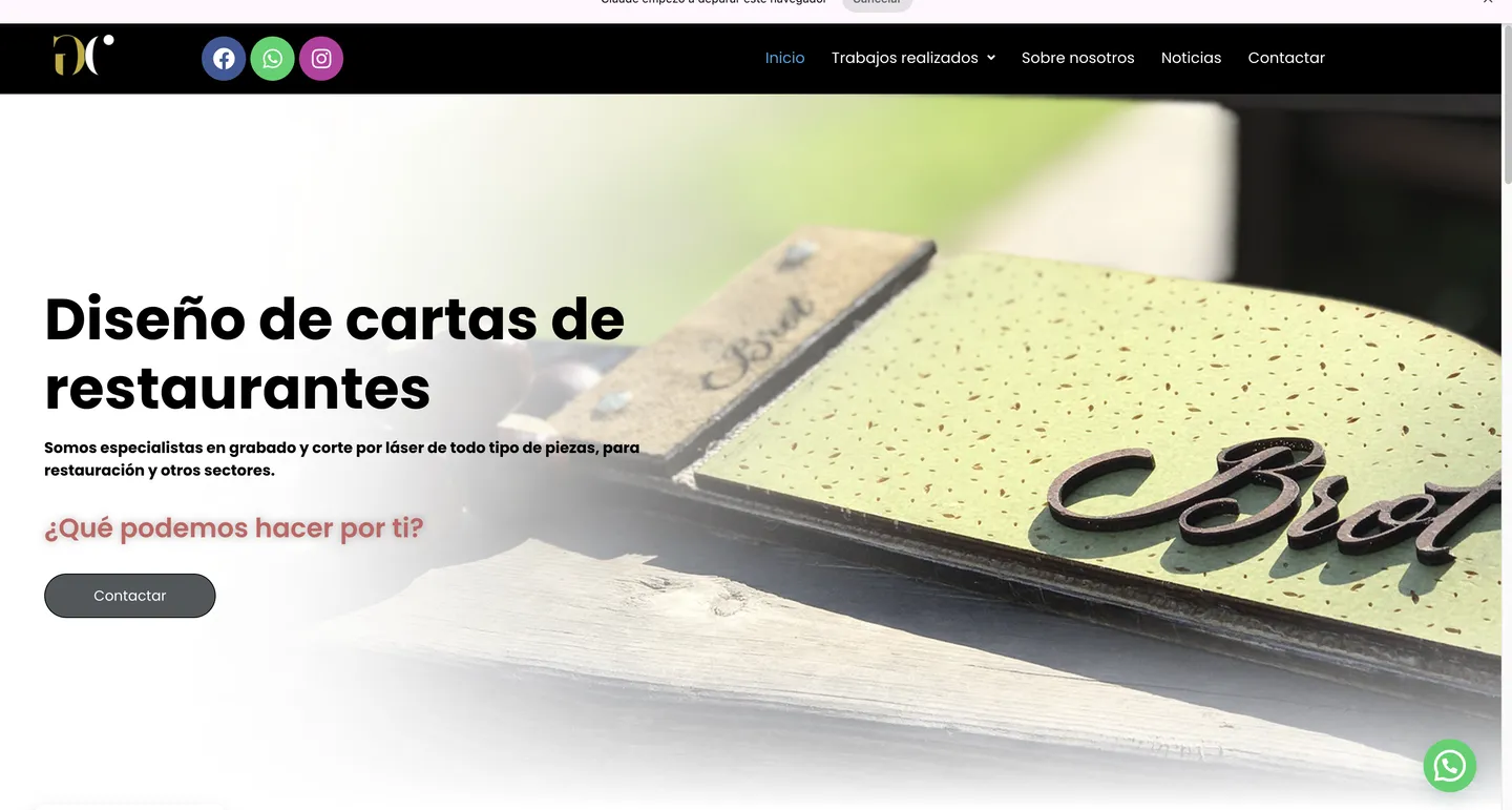
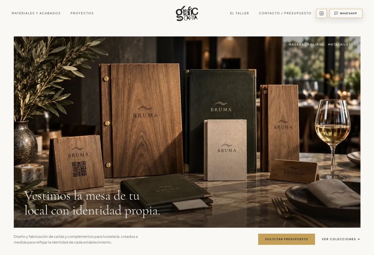
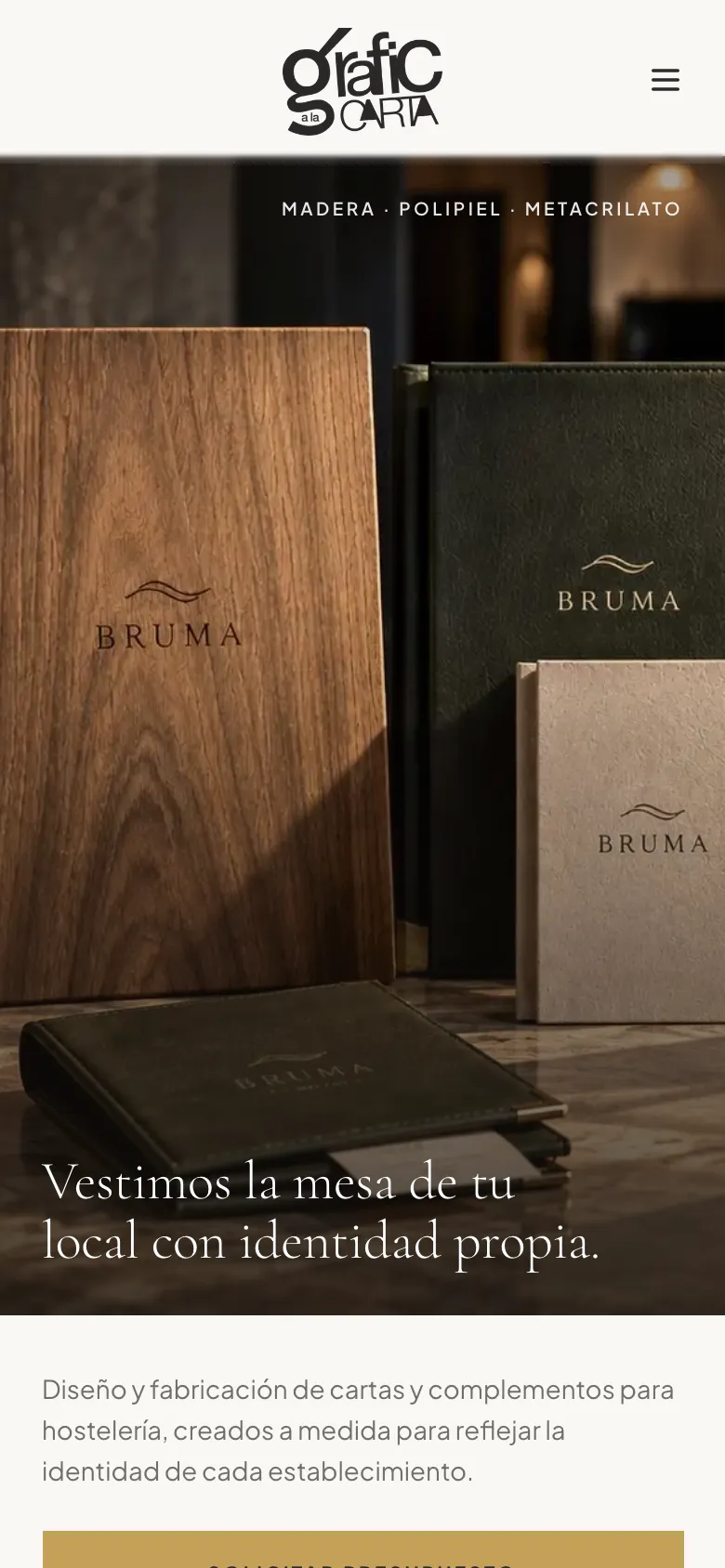
The home page goes from a descriptive headline and a generic button (“Contactar”) to a photograph of real production in a real restaurant and a single path: request a quote.
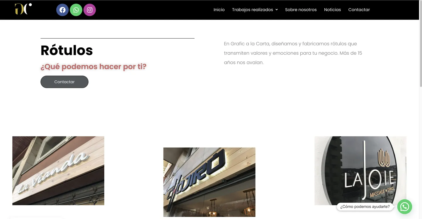
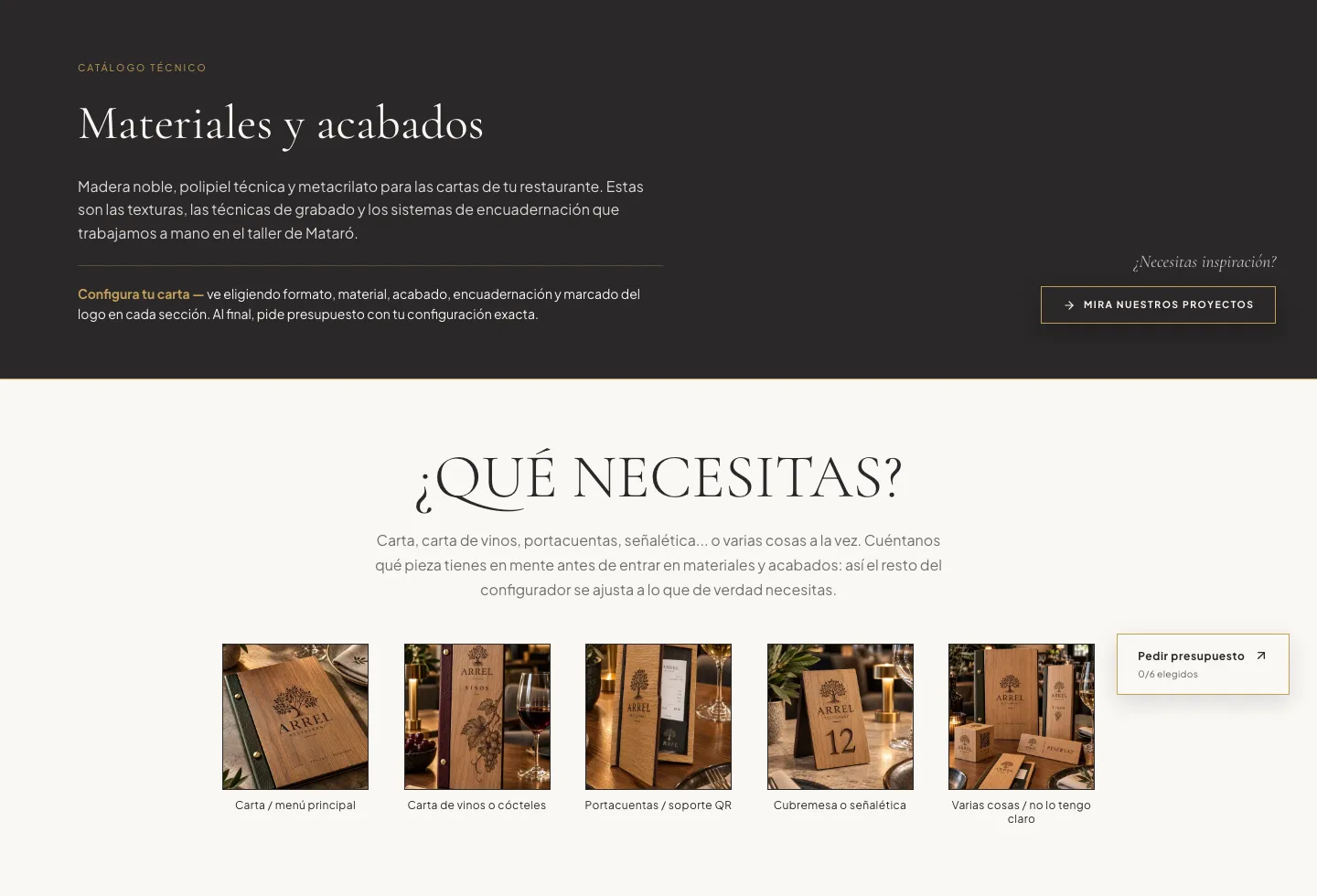
The old catalogue was a row of small thumbnails with no way to choose anything. Now it is a technical catalogue you walk through in five steps —format, material, finish, binding and logo marking— that ends in the quote.
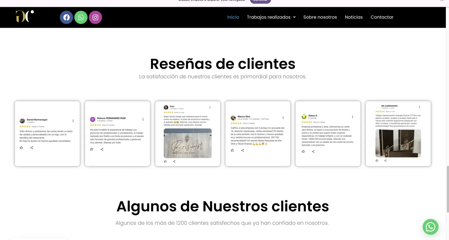
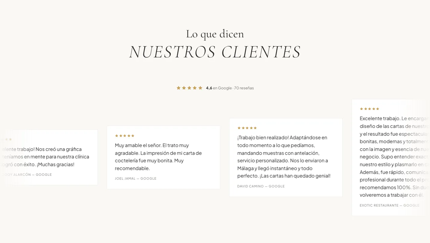
Reviews were small screenshots, impossible to read. Now they are text, with the author's name and Google's overall rating in plain view: the social proof that matters most to someone about to invest in a menu.
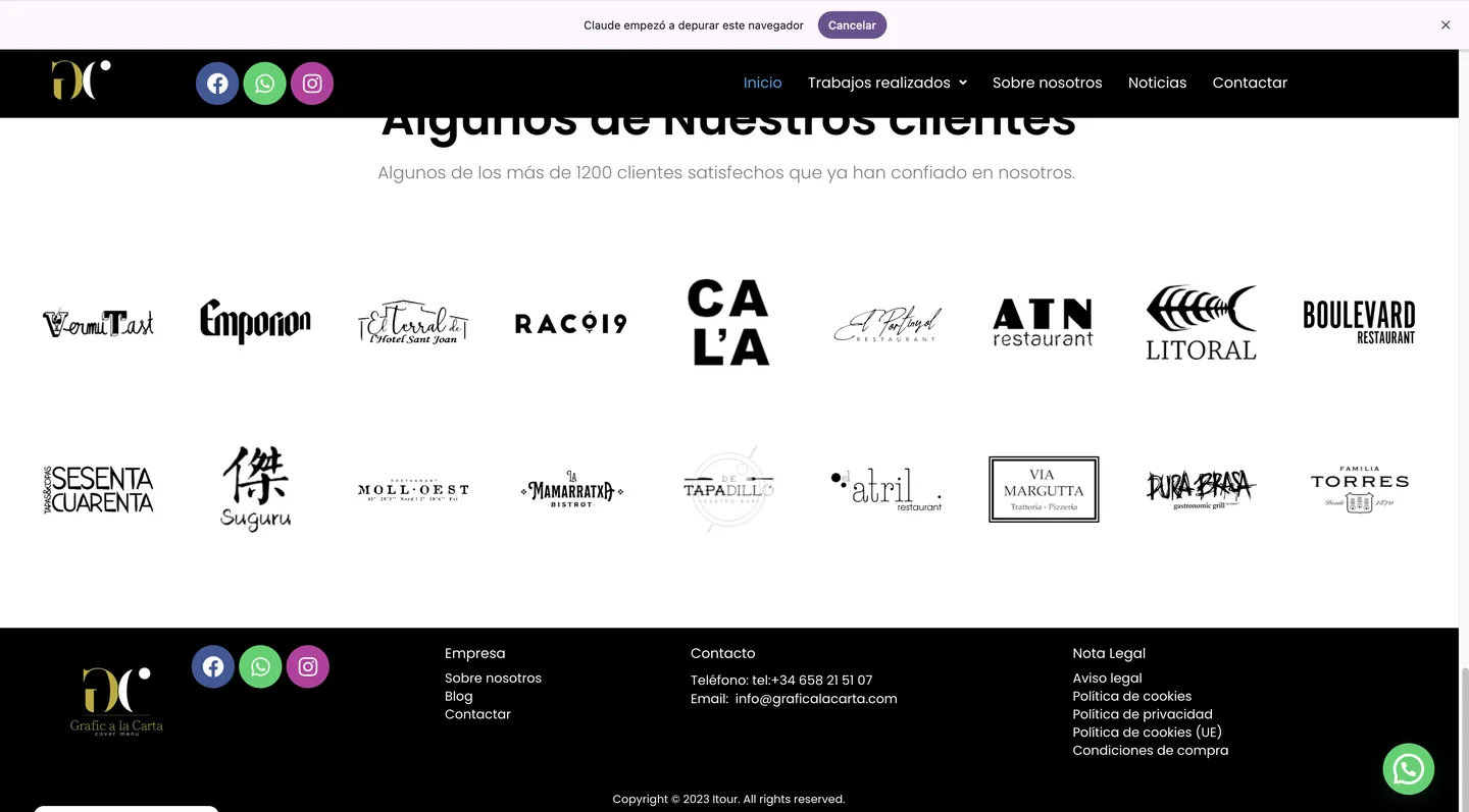
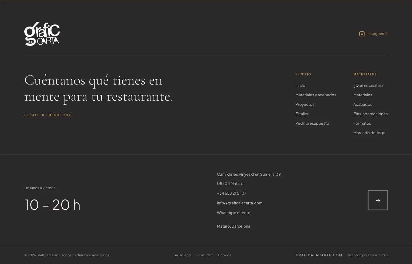
The footer stops being template leftovers and becomes one last invitation to ask for a quote, with the workshop's details properly displayed.
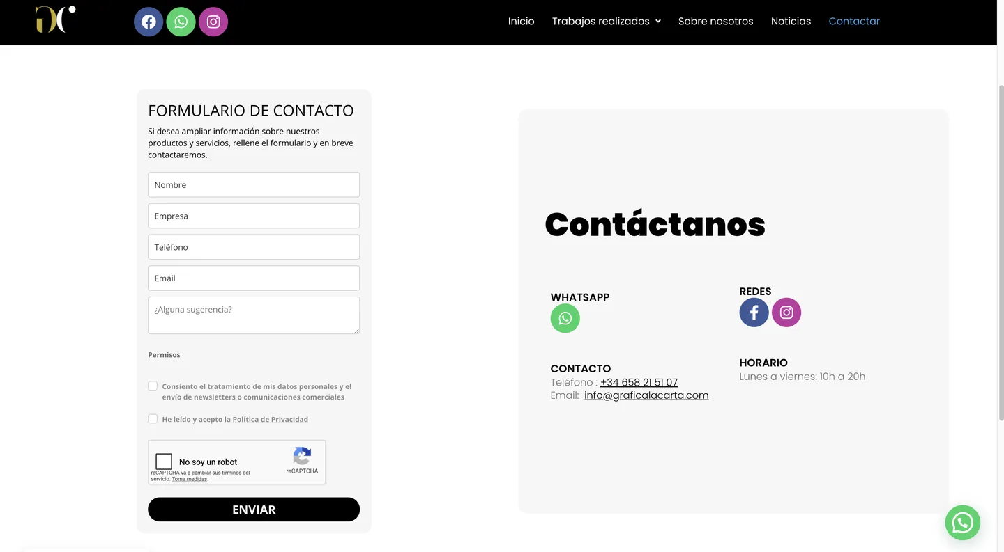
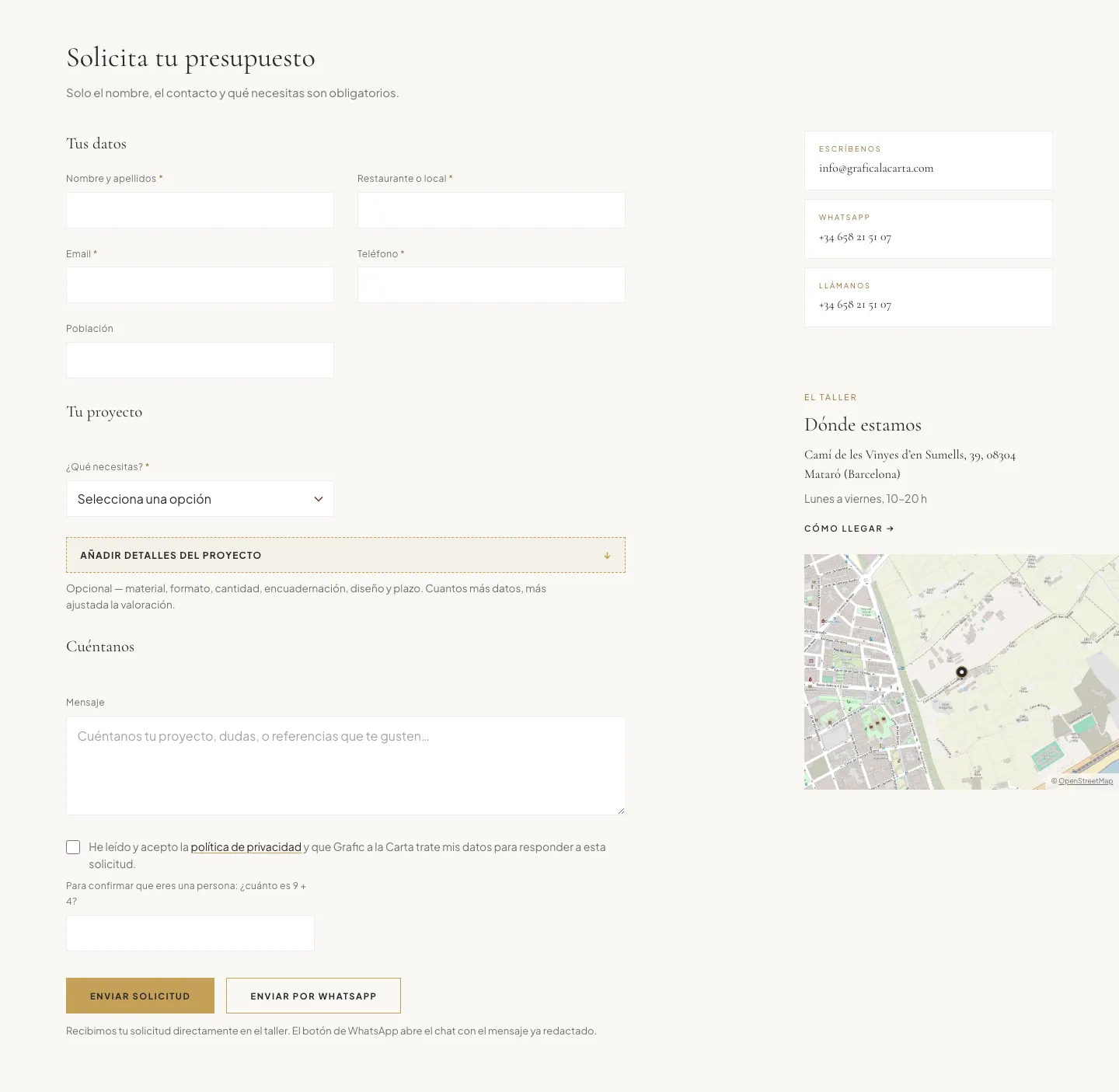
The old form asked what any website asks. The new one only requires the essentials —name, contact and what you need— and leaves the rest optional, with the option to send it by WhatsApp with the message already written.
A website that does one thing: lead to the quote.
Grafic a la Carta doesn't sell from a catalogue and has no online shop: every menu is made to measure and closed with a conversation. So the website didn't need to be a shop window to wander through, but a short, frictionless path to a well-formed quote request.
The whole design starts there: every page ends in an action, the quote button and WhatsApp are always in view, and nothing interrupts the journey.
Four steps, from curiosity to request.
We thought of the website as a short funnel. Each section pushes into the next and all of them lead to the same place.
- 01
See
The home page shows real product and says in one sentence what the workshop does. From the first scroll there is a quote button.
- 02
Configure
Materials and finishes turns the catalogue into a five-step configurator. The client chooses and reaches the form with the menu already defined.
- 03
Trust
Real projects with names, Google reviews with names and the workshop in view: the three proofs a restaurant needs before ordering.
- 04
Ask
A short form, WhatsApp with the message pre-written, and a phone number. Plus an FAQ answering what people ask most before writing.
Design decisions, and why.
- 01
Black and gold, their own
The palette comes from their logo and Instagram, not from a template. Gold is reserved for what invites action —buttons and steps— so it always means the same thing.
- 02
A serif, like a menu
Editorial-style serif headlines over simple text: it reads like a restaurant menu, which is exactly what they make.
- 03
Full-bleed photography, no decoration
The product leads: large photographs of real menus, no decorative icons or generic illustrations. If something doesn't show the work, it isn't there.
- 04
A catalogue organised the way clients think
By type of piece (menus, table accessories, digital menu, signs) and by material (wood, faux leather, acrylic). We started from an analysis of other sites in the sector and kept only what helps sell.
- 05
The workshop's own voice
Copy is in the first person plural and comes from what Grafic already says: its history since 2010, its process, its materials. The site speaks like them, not like an agency.
How it looks and how it works.
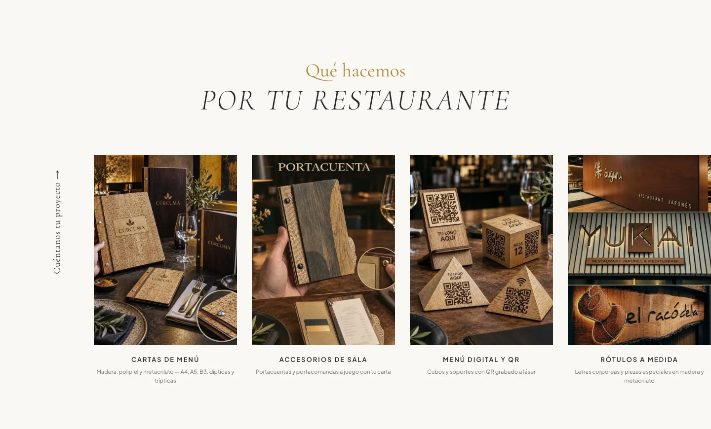
What we do: the four types of piece the workshop makes, with a direct route to “Tell us about your project”.
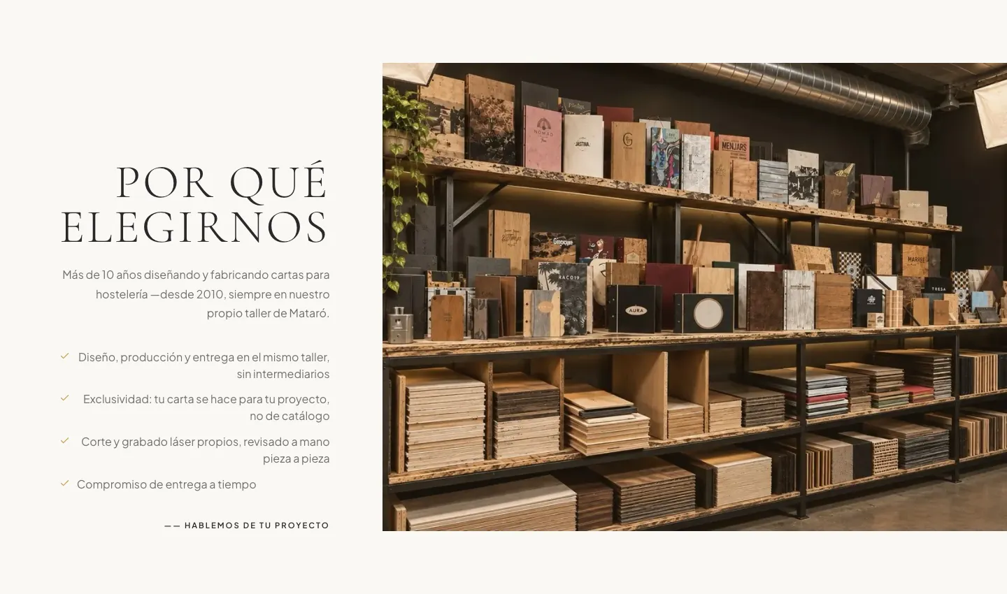
Why choose us: what sets the workshop apart, with visual proof —its shelves of samples— instead of adjectives.
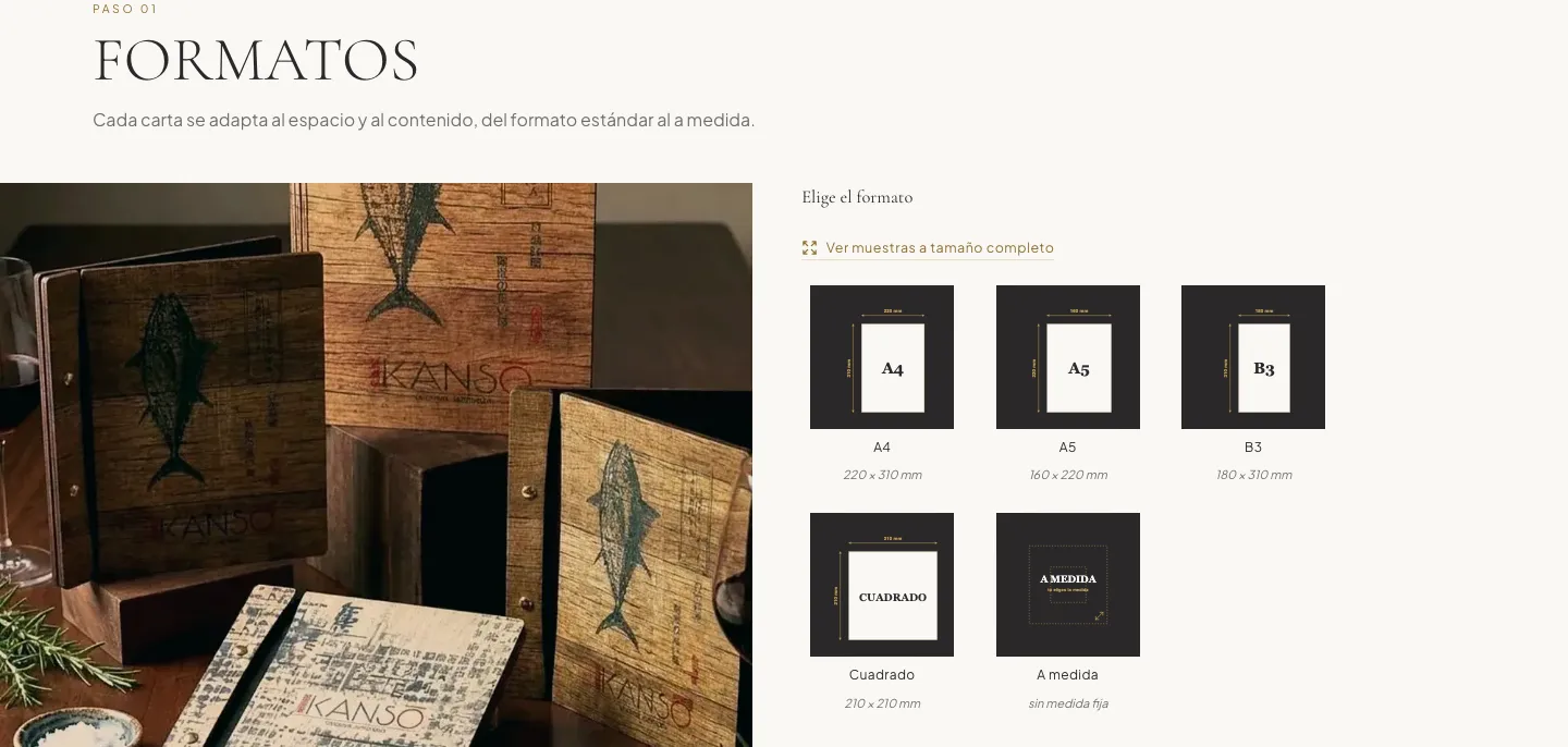
Step 1 · Formats: real sizes for A4, A5, B3, square and custom.
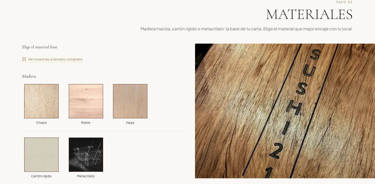
Step 2 · Materials: wood, rigid board and acrylic, with real samples.
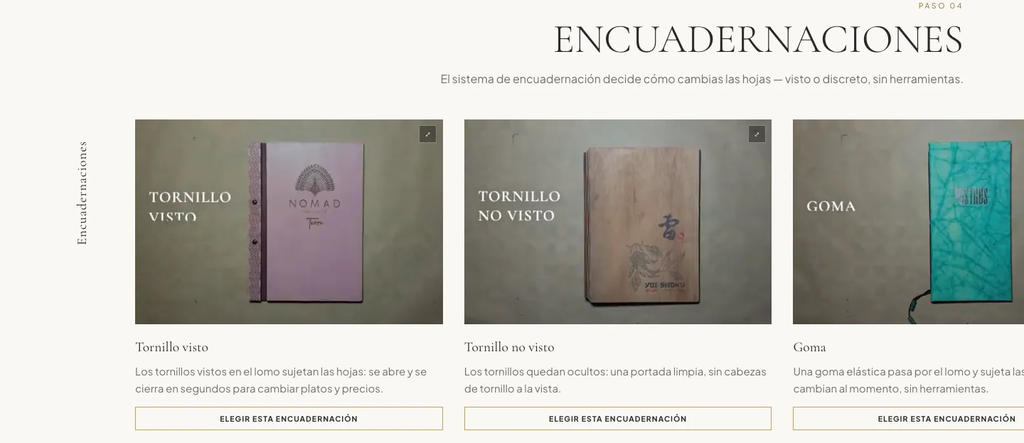
Step 4 · Bindings: each system explained, with a “Choose this binding” button.
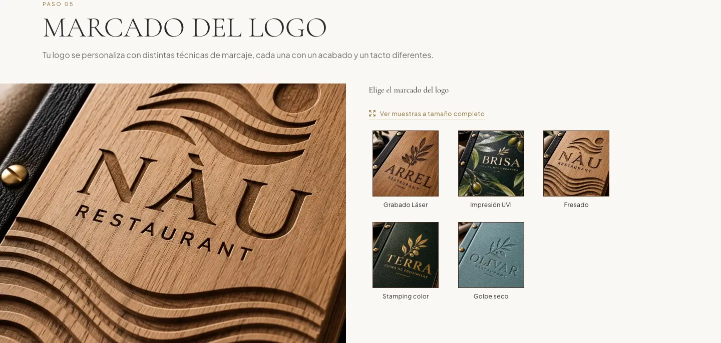
Step 5 · Logo marking: laser engraving, UV printing, milling, stamping and blind embossing on real pieces.
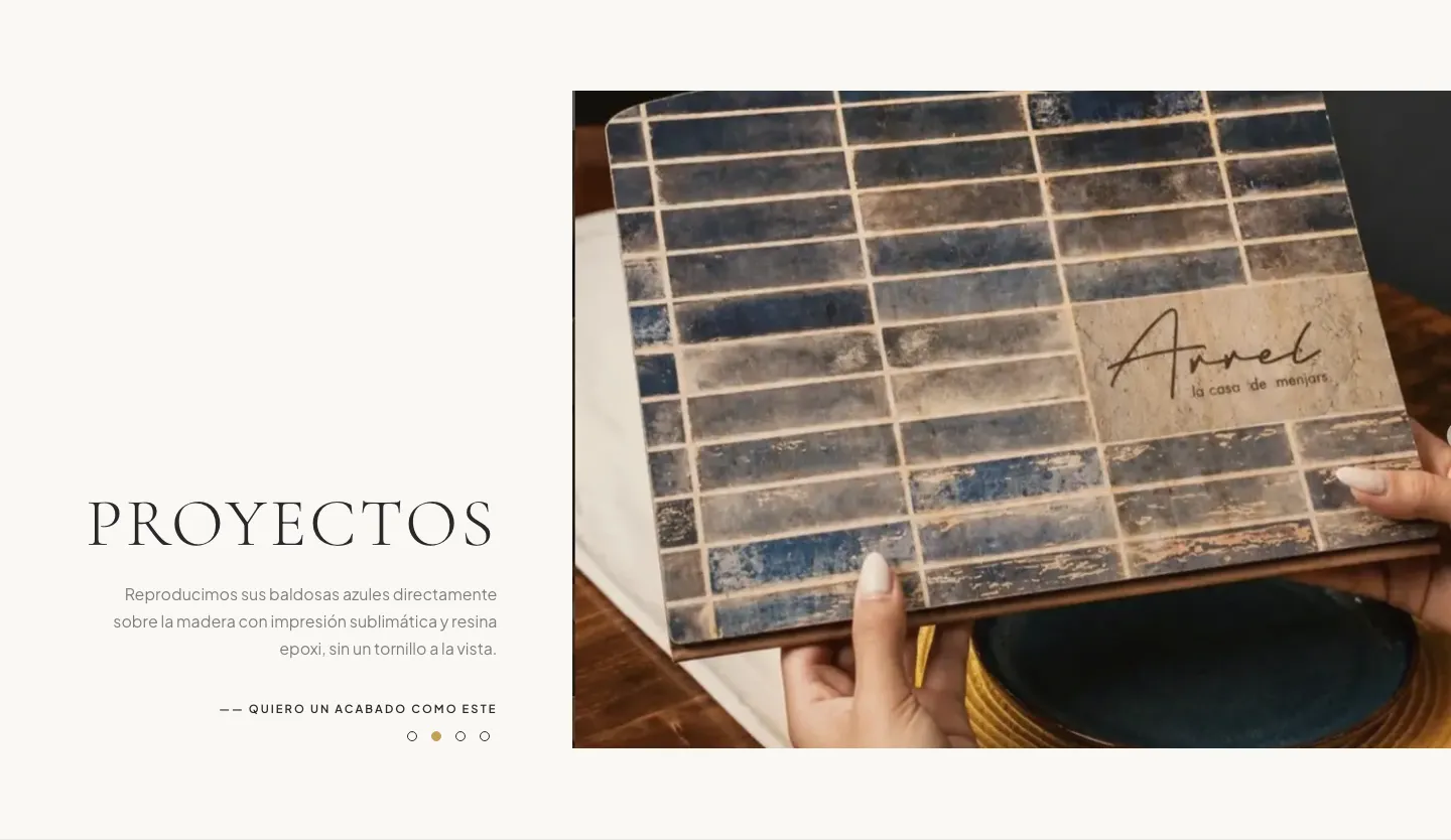
Projects: a real finish and a “I want a finish like this” button.

End of the configurator: “Request a quote with my configuration”.
What there is now.
real projects with name, photos and their own page
steps to configure the menu before asking for a quote
Google rating, with 70 reviews, now on the home page
ways to ask for a quote at any time: form, WhatsApp and phone
What changes for the workshop.
- 01
One identity
Website, Google and Instagram say the same thing: same name, same address, same style.
- 02
Clearer requests
The form arrives with piece type, material, format and binding already chosen: fewer back-and-forths before a price can be given.
- 03
Showing up where people search
Structured data with their real identity, a sitemap, consistent address and hours and a page per project: the base of local SEO.
- 04
A portfolio that grows
Every new project is its own page with its photos; it can be added without rebuilding anything.
- 05
Everything in one hand
Domain, hosting and email, managed by us so the workshop can focus on making.