← All projects
Case study · Artist · 11

M. Giménez

A portfolio website for a real artist, worked as a commission: strategy, art direction and every page designed so the work is looked at slowly and the commission comes by itself.

Client
M. Giménez · illustrator and watercolourist
What we did
Strategy, art direction, web design and development, SEO
Approach
A museum room: the work first, the commission second
Year
2026
Visit the website
mgimenezart.com
M. Giménez

A real artist and a commission, treated as one.

M. Giménez is an illustrator and watercolourist. Although the website is for Onaia's own founder, we worked it like any commission: a brief, objectives, a strategy and an art direction defined before drawing the first screen.

No invoice, but the same questions as always: who is looking, what do they need to understand and what do we want them to do.

A website that had to start from zero.

  1. 01

    Another name

    It started from an old website signed with a brand name that wasn't hers. The new one had to speak of her as an artist, under her own name.

  2. 02

    Nothing to inherit

    The previous website, on WordPress, was retired entirely. We started from scratch: no template, no plugins and no one else's decisions.

  3. 03

    Work that deserved a frame

    Watercolours and illustrations very different from each other, which needed a place to live together without competing.

Four decisions before designing.

  1. 01

    Sign with her own name

    The brand becomes “M. Giménez”, with an MG monogram and the line “Ilustración y acuarelas”. An artist with her own name, not a pseudonym.

  2. 02

    A room, not a catalogue

    The work is shown as in an exhibition: space, silence and a small wall label. That is what separates a portfolio from a shop.

  3. 03

    Two audiences, two rooms

    Private clients looking for a piece or a keepsake, and brands or projects looking for an illustrated eye. Watercolours and illustrations each have their own room and way of speaking.

  4. 04

    Always a door to the commission

    On every page there is a gentle way to take the step —ask for a print, commission a watercolour, talk about a project— without pushing the visitor.

Black and white until you stop.

  1. 01

    The works wait in black and white

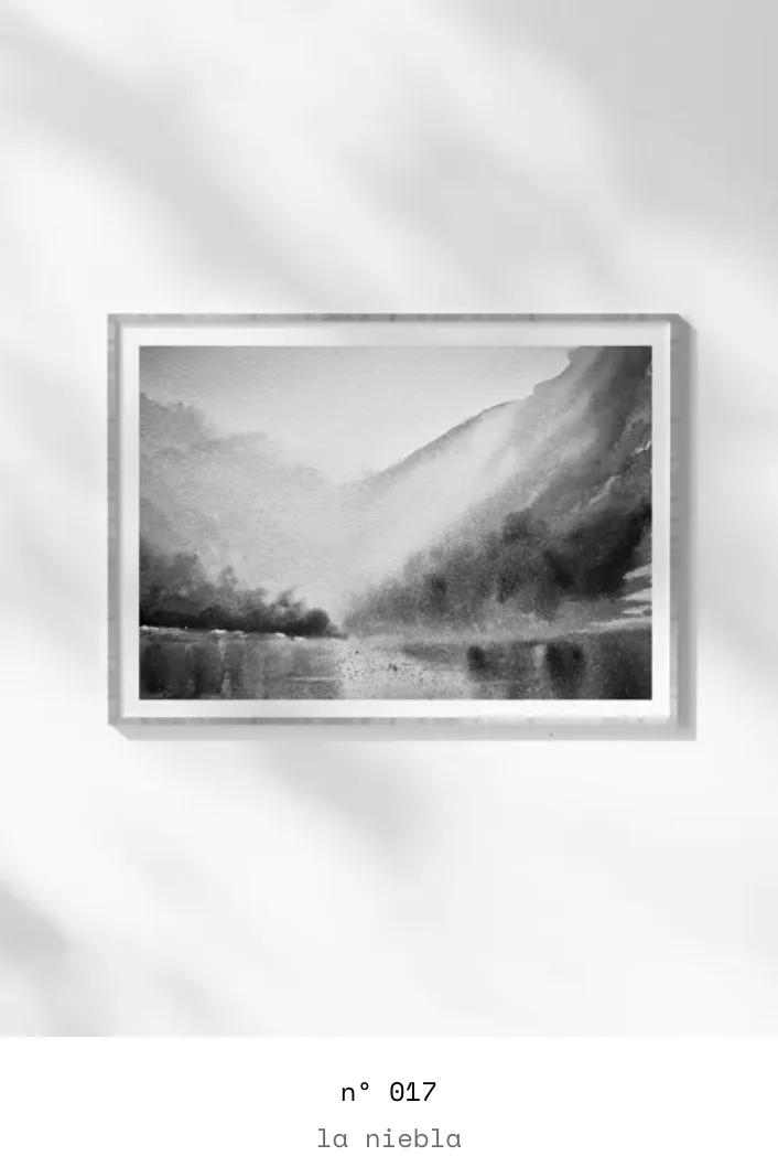
    All pieces are shown in greyscale, framed against a bright wall. The page is sober and colour competes with nothing.

  2. 02

    Colour is revealed when you stop

    As the cursor approaches, the work recovers its colour. It isn't a decorative effect: it is the gesture of stepping closer to a painting. On touch screens, where there is no cursor, pieces are shown directly in colour.

  3. 03

    A label, not a headline

    Each piece carries only a small number and a name, like a gallery wall label. No loud titles to cover the work.

  4. 04

    Works, framed

    Illustrations and watercolours are shown framed, with a wall shadow, so they read as objects, not files.

At rest and on stopping.

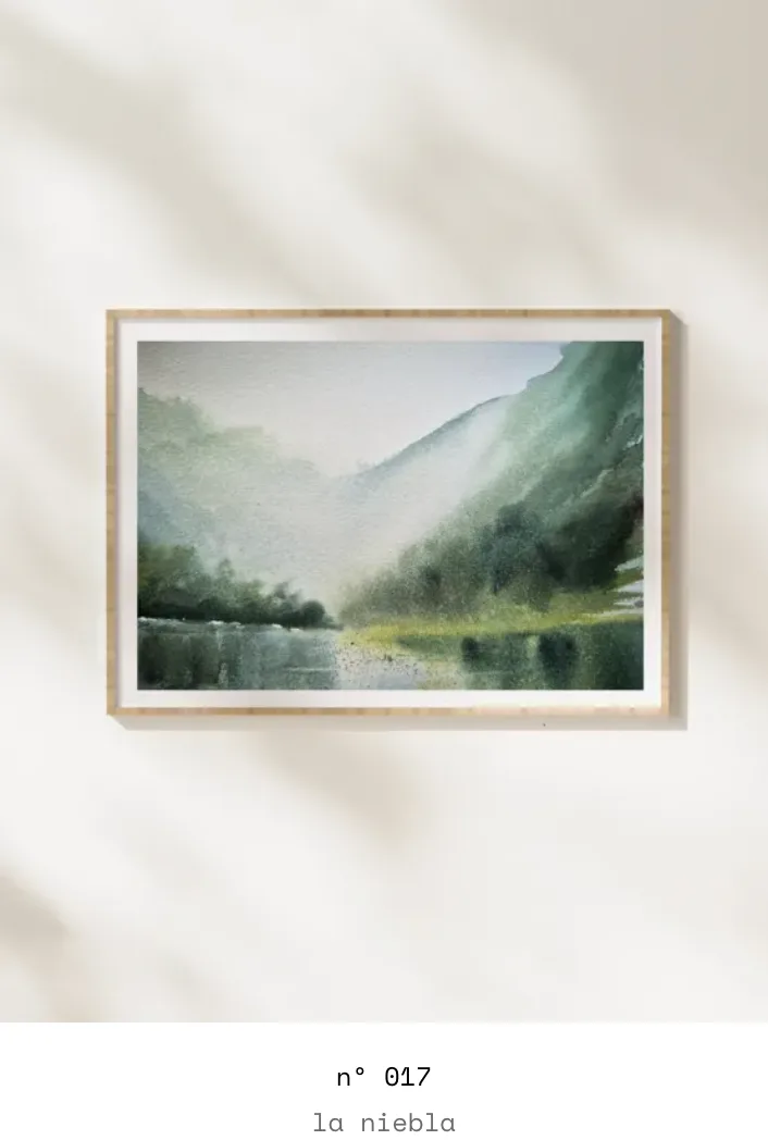
At restWatercolour no. 017, in greyscale
mgimenezart.com
Watercolour no. 017, in greyscale
On stoppingThe same piece, in colour
mgimenezart.com
The same piece, in colour

The same work, before and after stepping closer. The change lasts as long as it takes to look with attention.

Every page, with its why.

An artist's portfolio isn't a single screen: it's a journey. This is what each page does and why.

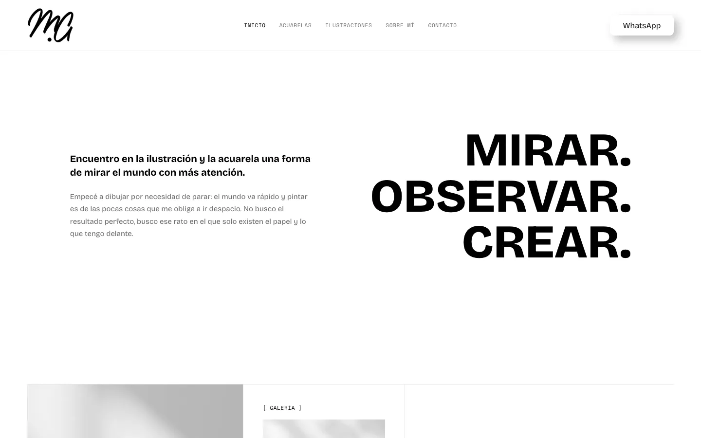
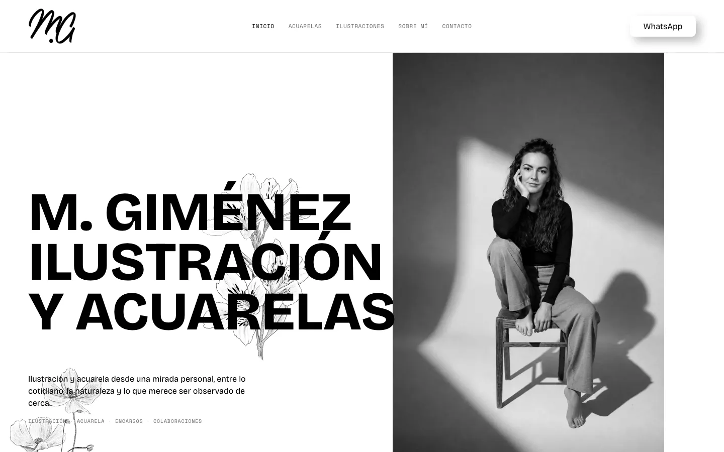
01 · Home — the foyer

Mirar. Observar. Crear.

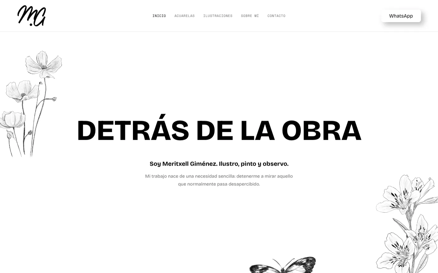
The home page is the museum's foyer: before seeing a single work, the visitor steps into an atmosphere. Then the two rooms, and at the end the door to the commission.

  • An illustrated background of her own: eight of her illustrations drift slowly, in vertical lanes, behind the title. It is pure movement, with no response to scroll: the site feels alive without hijacking the visitor.
  • Botanical drawings by the artist herself —flowers, a butterfly— float across the page. They aren't generic decoration: it is the same line that signs the work.
  • A positioning line and four labels —illustration, watercolour, commissions, collaborations— that say in a second what she does and what she can be hired for.
  • An exhibition wall with framed works and, at the end, a calm invitation: “Have an idea?”.
mgimenezart.com
Mirar. Observar. Crear.
mgimenezart.com
Mirar. Observar. Crear.
mgimenezart.com
Mirar. Observar. Crear.
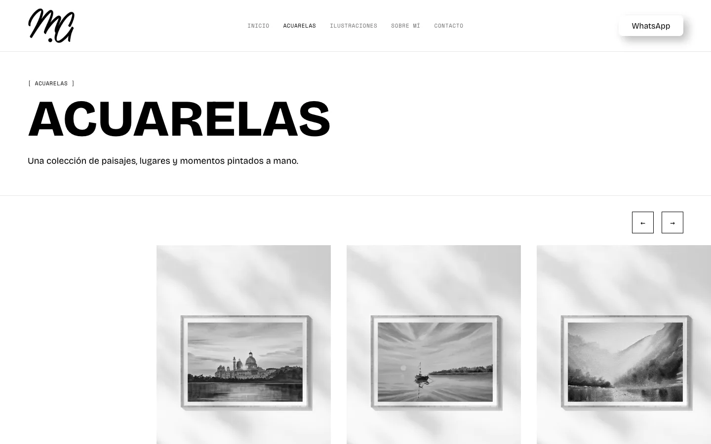
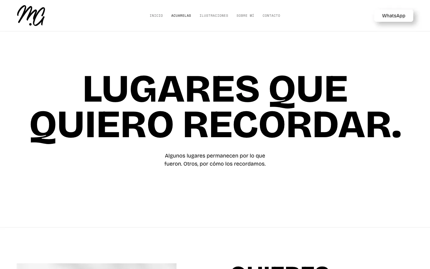
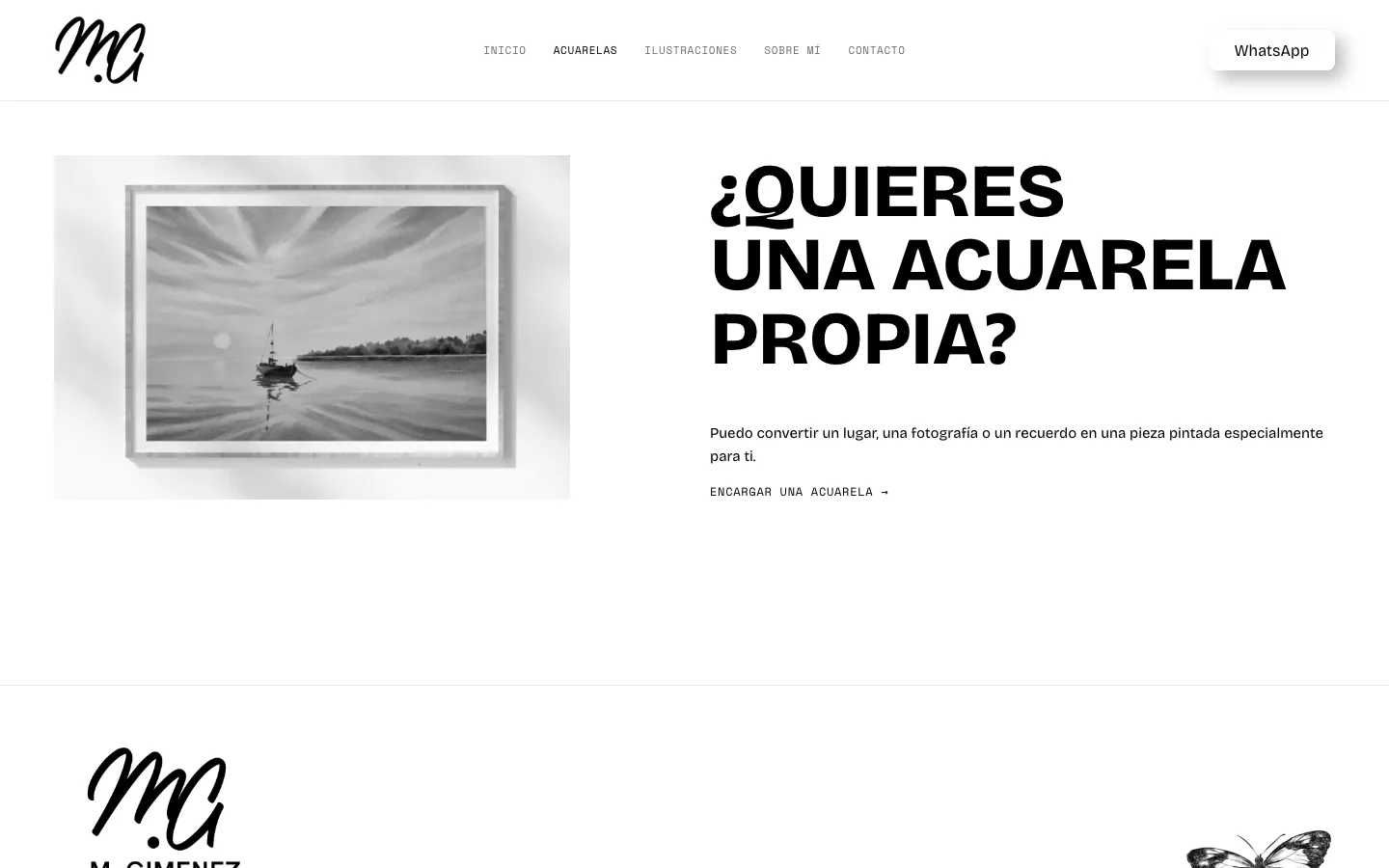
02 · Watercolours — the room

Places I want to remember.

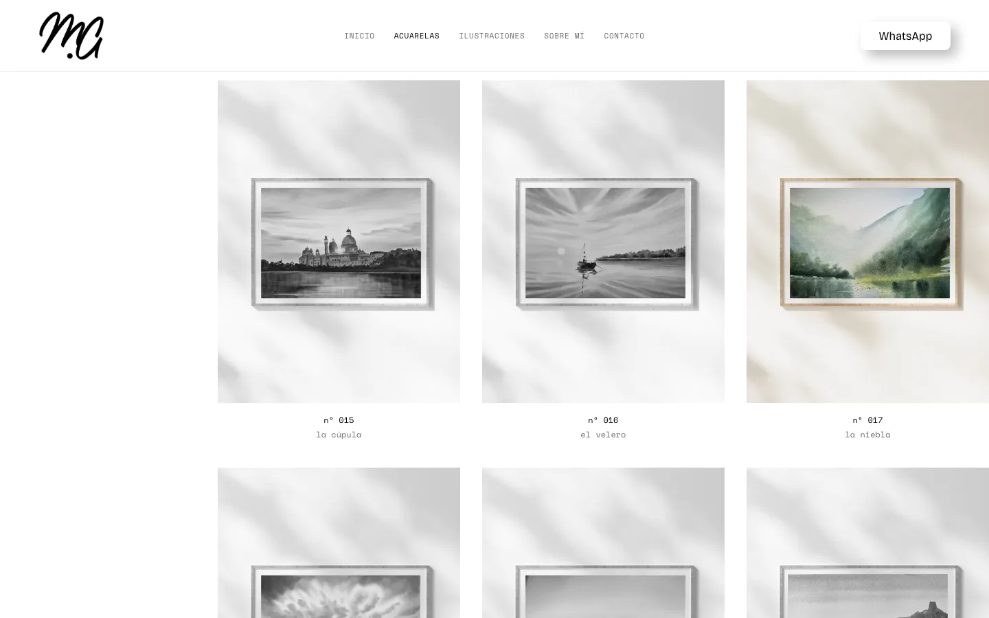
The watercolour room speaks of memory more than of product: landscapes, architecture and small moments moved onto paper. That's why the text is short and the tone intimate.

  • A horizontal gallery in two rows, with arrows or swiping: walked sideways like a wall, with no endless vertical scroll.
  • A close that offers the one thing not hanging in the room: a commissioned watercolour, “Want a watercolour of your own?”, of a place or memory of the visitor's.
mgimenezart.com
Places I want to remember.
mgimenezart.com
Places I want to remember.
mgimenezart.com
Places I want to remember.
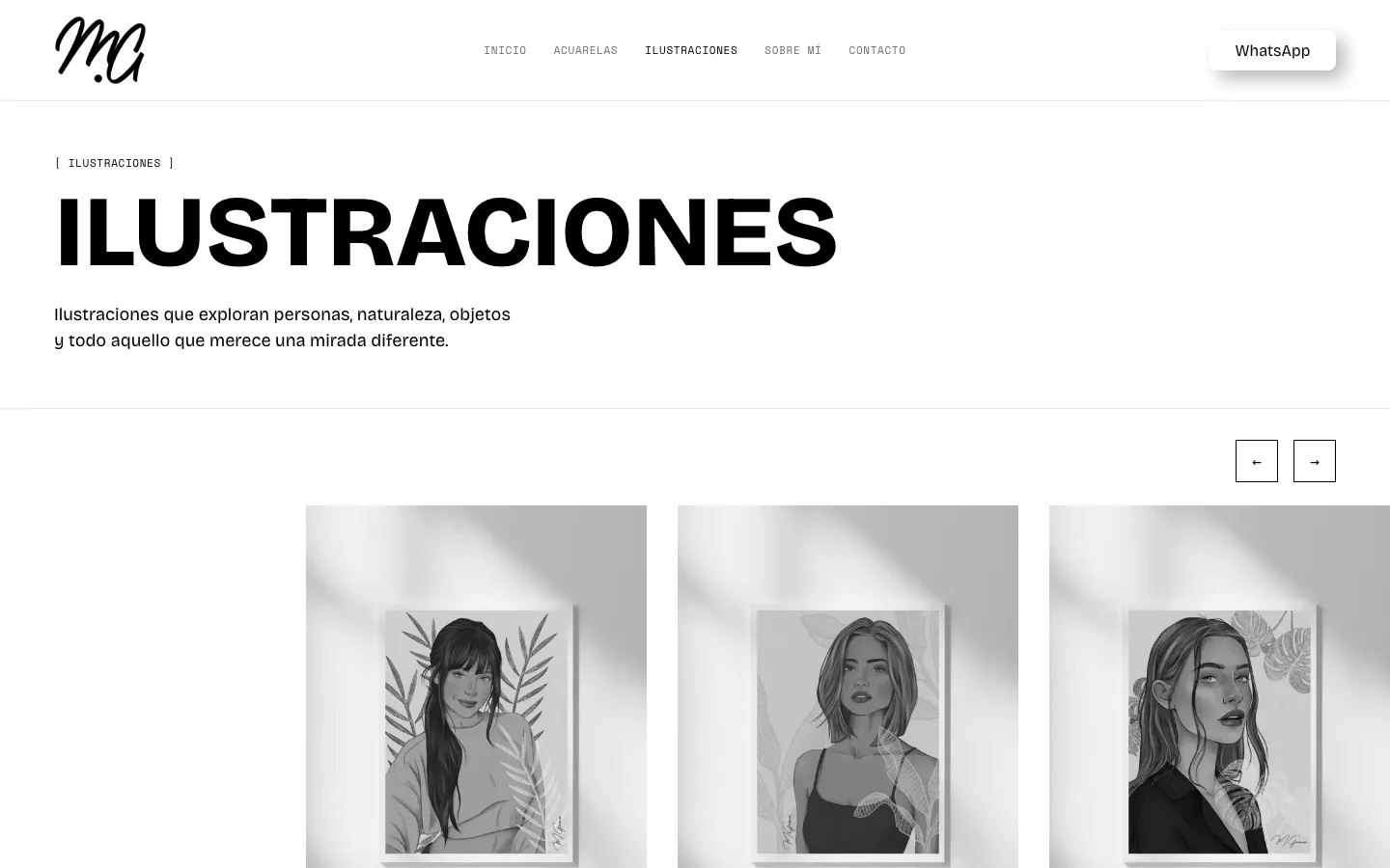
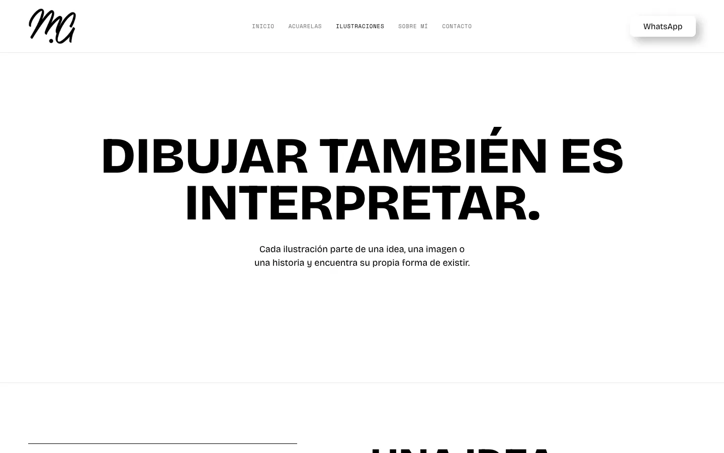
03 · Illustrations — the other room

Drawing is also interpreting.

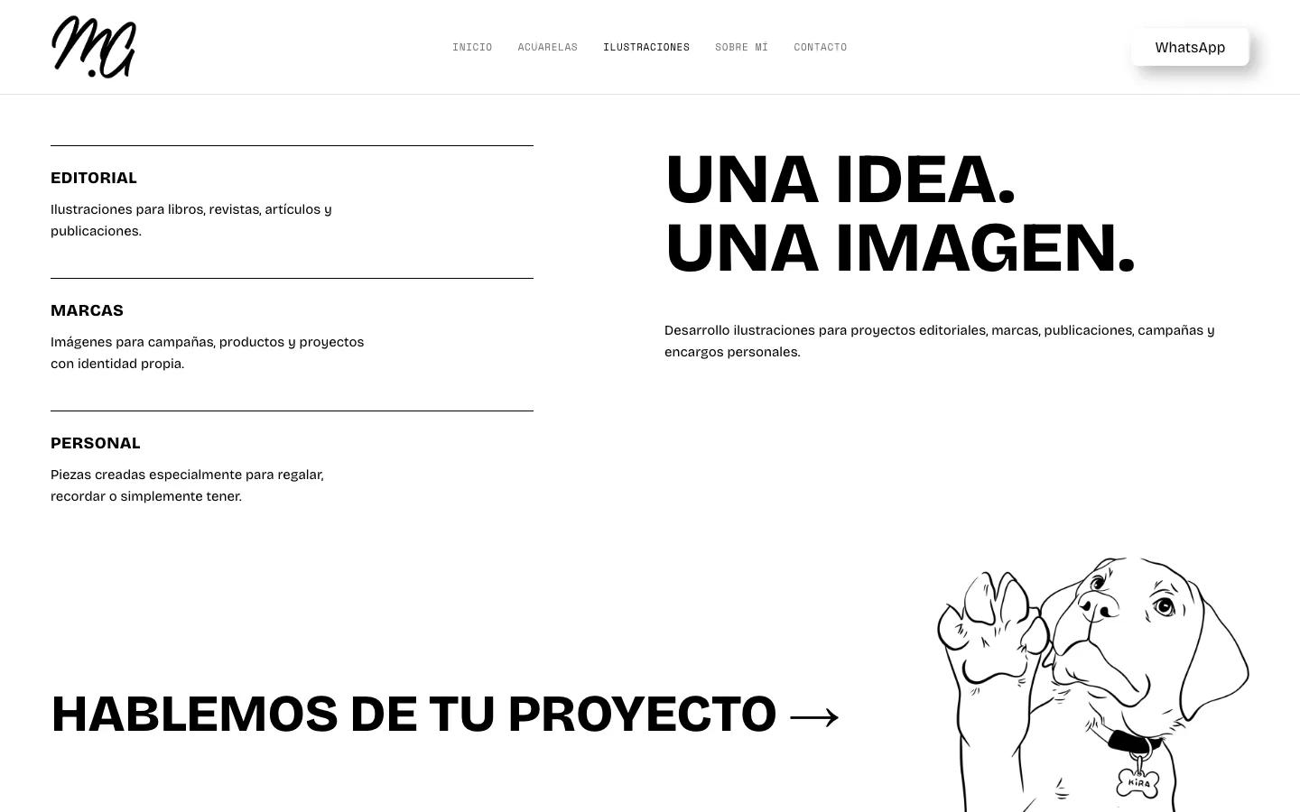
The second room speaks to a different audience: someone looking for an illustrated eye for a project. So the tone here is more professional and the work is explained as a method.

  • “One idea. One image.”: three lines of work —editorial, brands and personal— so a professional client recognises themselves at once.
  • The same gallery and the same wall label as in watercolours: two different rooms, one language.
  • A close with a line drawing —a dog— that lowers the tone and reminds you there is a person behind it.
mgimenezart.com
Drawing is also interpreting.
mgimenezart.com
Drawing is also interpreting.
mgimenezart.com
Drawing is also interpreting.
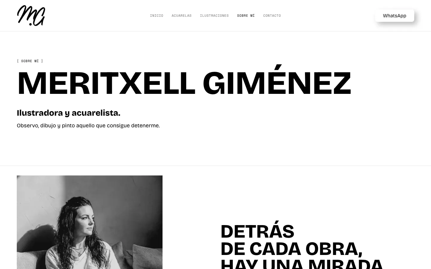
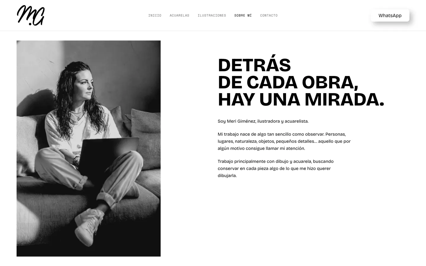
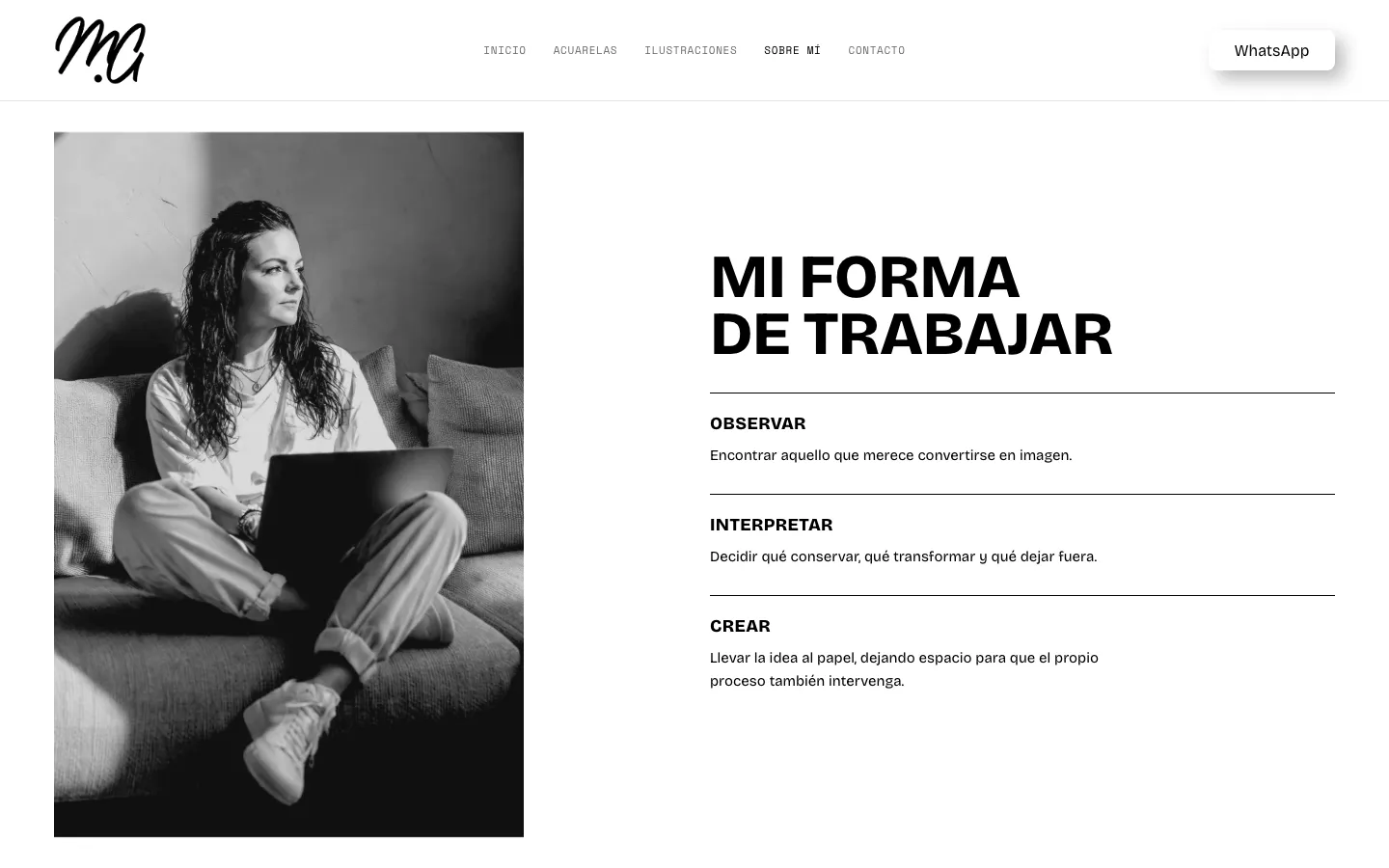
04 · About — the author's space

Behind every work, a way of looking.

When you hire an artist you hire a way of looking. So the page about her isn't a biography: it's an explanation of how she looks and how she works.

The texts are in the first person and are hers, as written: here the design only had to hold them.

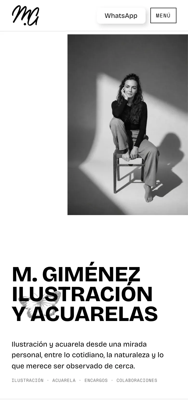
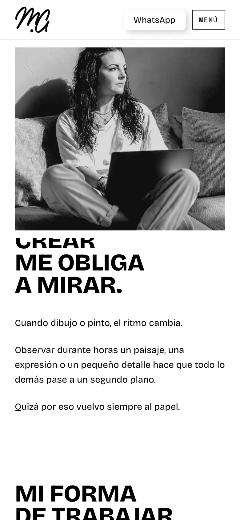
  • Her portrait stays fixed on the left while five text panels scroll up on the right: behind every work, creating makes me look, how I work (observe, interpret, create), drawing and watercolour, and also commissions.
  • On mobile the photo stays in a fixed strip under the header and the text passes beneath it, so the person never disappears from the reading.
  • It closes with one single action: “Get in touch”.
mgimenezart.com
Behind every work, a way of looking.
mgimenezart.com
Behind every work, a way of looking.
mgimenezart.com
Behind every work, a way of looking.
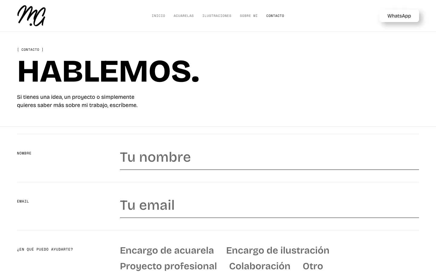
05 · Contact — the door

Let's talk.

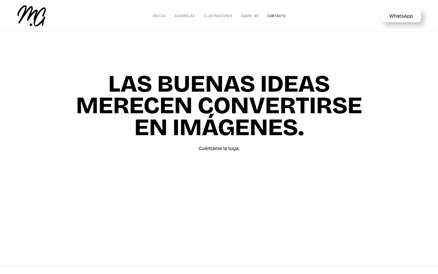
A commission starts with a conversation, so the form had to feel like one: few questions, well put and without noise.

  • An editorial form, with no box: thin-ruled rows with the label at the side, like a record card.
  • “How can I help?” as a list of options —watercolour commission, illustration commission, professional project, collaboration— so the request arrives already sorted.
  • A reference image can be attached, and the message arrives pre-filled if the visitor comes from “Ask for this print”.
  • It closes with a line: “Good ideas deserve to become images”.
mgimenezart.com
Let's talk.
mgimenezart.com
Let's talk.

Few rules, firmly held.

  1. 01

    Pure black and white

    No cream or warm tones: the only colour on the site is the works themselves.

  2. 02

    Two typefaces, with rules

    A monospaced one only for short labels and numbering; a grotesque for everything else. Wherever there is information, always the one that reads well.

  3. 03

    Square corners

    Clean geometry, no rounding: the only curve is the work's.

  4. 04

    A label as the unit

    Number and name, small, wherever a work appears: in the room, on its page and on the home wall.

The room, in your hand.

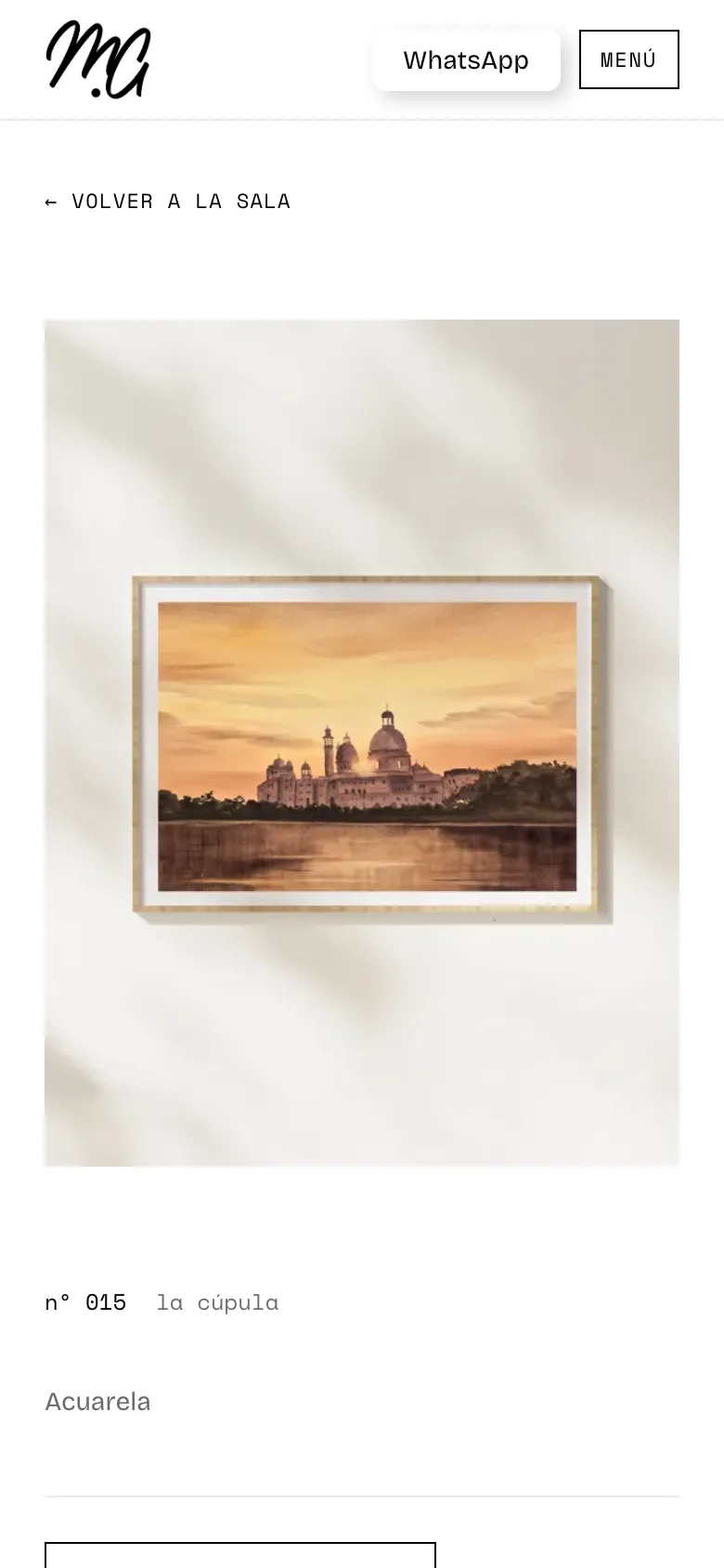
An artist's website is looked at, above all, from a phone. On mobile the menu opens full screen, the pieces turn to colour —there's no cursor to reveal them—, the About photo stays fixed and each work keeps its own page.

Home: the portrait, the title and the illustrated background.
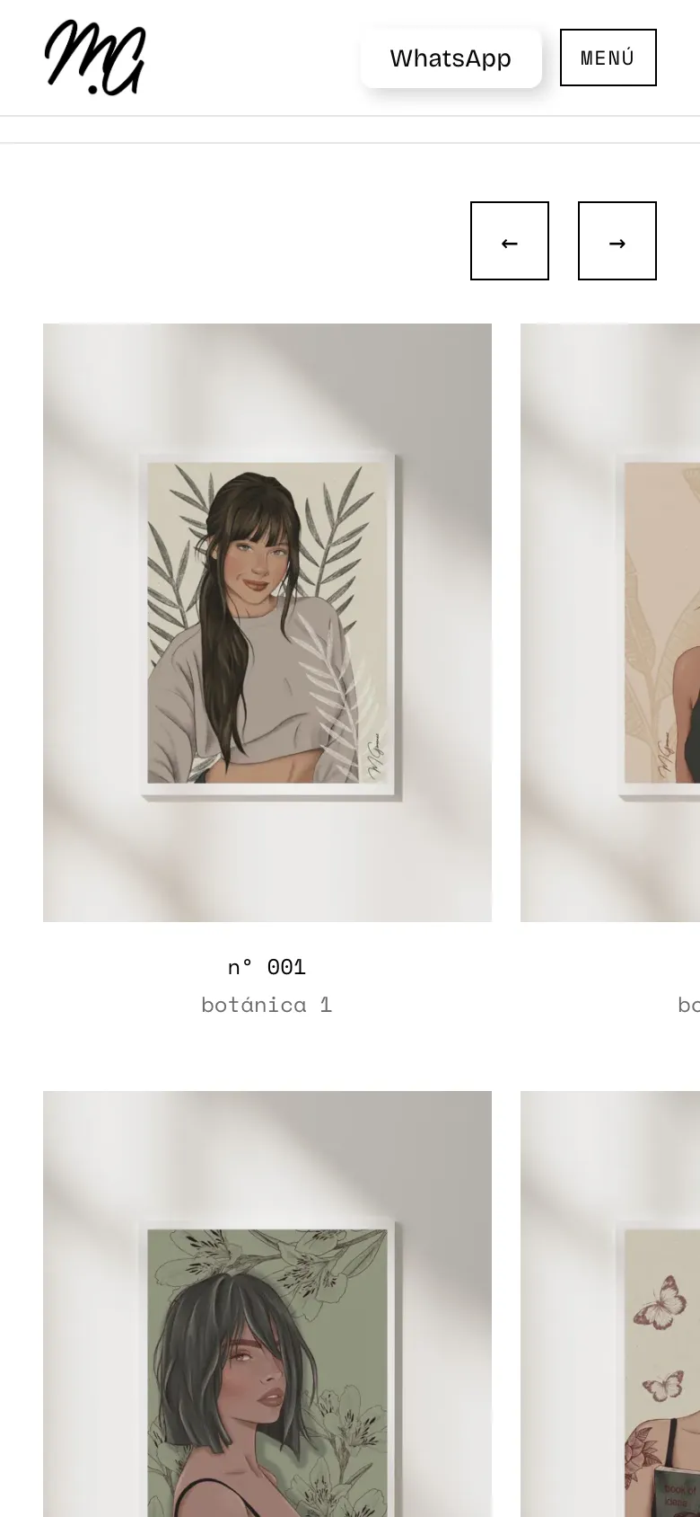
Illustrations: the gallery, already in colour.
A work's page, with its label.
About: the fixed photo and the text below.

A published, handmade website.

The website is live and working: a real commission and print order form with image attachment, its own legal pages, a base of SEO (sitemap, descriptions, share image) and a favicon. It is built in plain HTML, CSS and JavaScript, with no templates or builders: it loads fast, fonts are served from its own site and it is hers.

It is also our proof that an artist's website doesn't have to look like a shop: it can look like an exhibition.

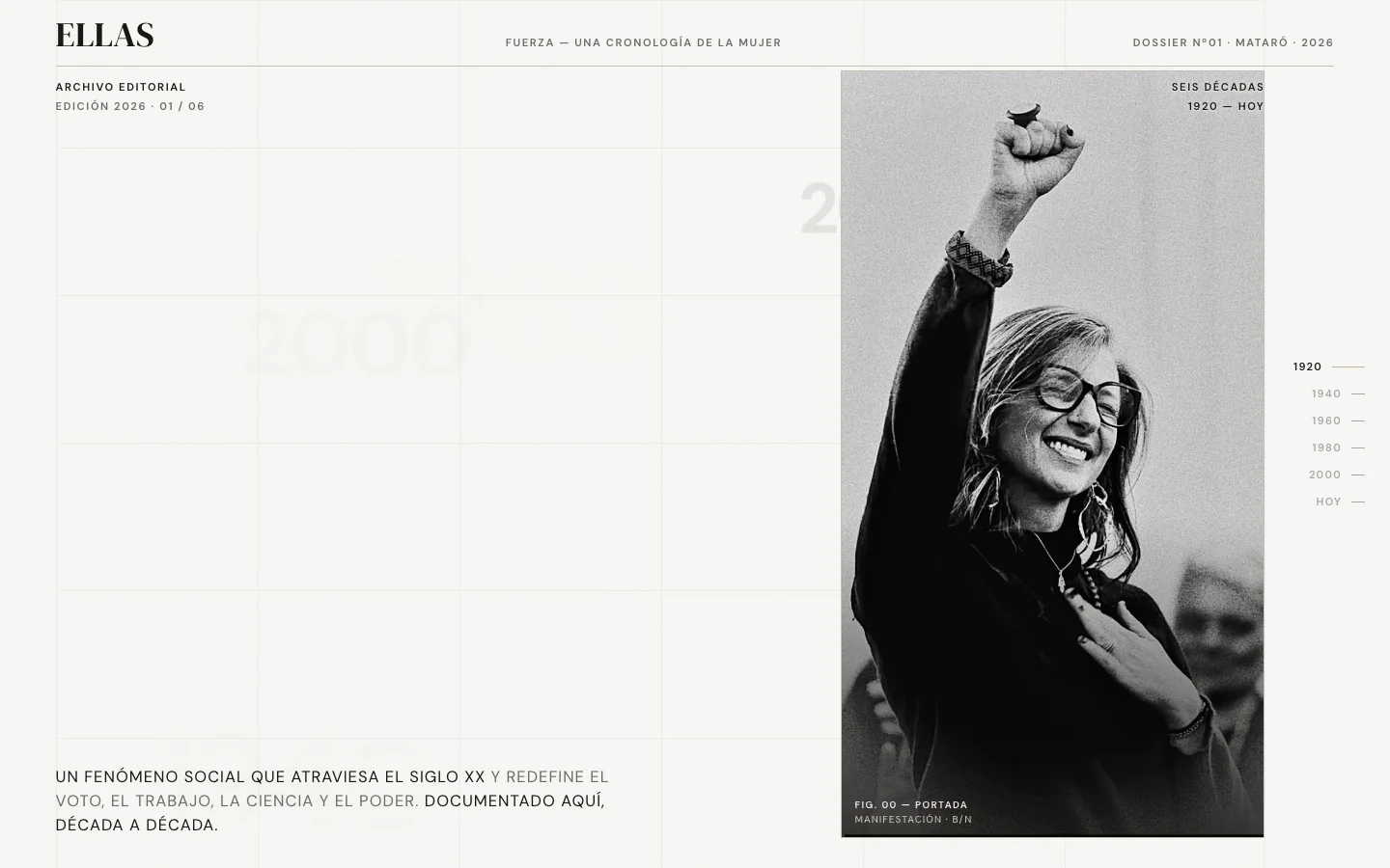
Next projectFUERZA
FUERZA
Your business too
YOUR BUSINESS
SHOULD ALSO
BE HERE.
Let's talk about your project